Are extra-innings contests evenly matched? (Mets Game 14) April 21, 2016
Posted by tomflesher in Baseball, Economics.Tags: extra innings, Mets game 14, probability, statistics
add a comment
The Mets lost to the Phillies in 11 innings last night. That was a surprising result – based on the run scoring in the first two games, the Pythagorean expectation for the same Mets team facing the same Phillies team would have been around 95.5%. Even going into extra innings seemed to be a stretch with Bartolo Colon pitching. Plus, the Phillies were in the bottom of the league in extra innings last year.
Addison Reed blew his first save of the year when he allowed a single to Peter Bourjos that scored David Lough. Despite strong performances from Antonio Bastardo and Jim Henderson, Hansel Robles allowed a double, a wild pitch, and a single that brought Freddy Galvis home.
Once we hit the tenth inning, it’s evidence that the teams are evenly matched, right? Not necessarily. in 2015, there were 212 extra-innings games. The home team won 111 of them, about 52.4%. That’s obviously higher than expected, but keep in mind that if this were a fifty-fifty coin flip we’d expect at least 111 wins around 22.5% of the time. Where it gets interesting is that the home team has (with the exception of 2014) consistently won over half those games, but that the more games that are played, the better visitors do. Since 2006, 2144 extra-innings games have been played with teams winning 1130 of them for a .527 winning percentage; that’s something that, if this truly is a 50-50 proposal, should only happen by chance 0.6% of the time.
| Year | G | W | L | perc |
| 2006 | 185 | 105 | 80 | 0.568 |
| 2007 | 220 | 117 | 103 | 0.532 |
| 2008 | 208 | 108 | 100 | 0.519 |
| 2009 | 195 | 106 | 89 | 0.544 |
| 2010 | 220 | 116 | 104 | 0.527 |
| 2011 | 237 | 134 | 103 | 0.565 |
| 2012 | 192 | 96 | 96 | 0.500 |
| 2013 | 243 | 125 | 118 | 0.514 |
| 2014 | 232 | 112 | 120 | 0.483 |
| 2015 | 212 | 111 | 101 | 0.524 |
| Total | 2144 | 1130 | 1014 | 0.527 |
One other result gives us pause: from 2006-2015, 24297 games were played and the home team won 13171 of them. That’s a considerable home field advantage, since all teams play half their games on the road and half at home. That corresponds to a .542 win probability for any home team. If that, rather than .500, is the expected win rate for a home team, then teams perform significantly worse in extra innings.
In other words, though the home team still has an advantage, that advantage shrinks once we hit the tenth inning.
The Mets are idle tonight. They’ll pick up in Atlanta on Friday.
What is OPS? January 12, 2015
Posted by tomflesher in Baseball.Tags: evergreen, OBP, OPS, SLG, statistics
2 comments
Sabermetricians (which is what baseball stat-heads call ourselves to feel important) disregard batting average in favor of on-base percentage for a few reasons. The main one is that it really doesn’t matter to us whether a batter gets to first base through a gutsy drag bunt, an excuse-me grounder, a bloop single, a liner into the outfield, or a walk. In fact, we don’t even care if the batter got there through a judicious lean-in to take one for the team by accepting a hit-by-pitch. Batting average counts some of these trips to first, but not a base on balls or a hit batsman. It’s evident that plate discipline is a skill that results in higher returns for the team, and there’s a colorable argument that ability to be hit by a pitch is a skill. OBP is 
We also care a lot about how productive a batter is, and a productive batter is one who can clear the bases or advance without trouble. Sure, a plucky baserunner will swipe second base and score from second, or go first to third on a deep single. In an emergency, a light-hitting pitcher will just bunt him over. However, all of these involve an increased probability of an out, while a guy who can just hit a double, or a speedster who takes that double and turns it into a triple, will save his team a lot of trouble. Obviously, a guy who snags four bases by hitting a home run makes life a lot easier for his teammates. Slugging percentage measures how many bases, on average a player is worth every time he steps up to the plate and doesn’t walk or get hit by a pitch. Slugging percentage is 
OPS is just On-Base Percentage plus Slugging Percentage. It doesn’t lend itself to a useful interpretation – OPS isn’t, for example, the average number of bases per hit, or anything useful like that. It does, however, provide a quick and dirty way to compare different sorts of hitters. A runner who moves quickly may have a low OBP but a high SLG due to his ability to leg out an extra base and turn a single into a double or a double into a triple. A slow-moving runner who can only move station to station but who walks reliably will have a low SLG (unless he’s a home-run hitter) but a high OBP. An OPS of 1.000 or more is a difficult measure to meet, but it’s a reliable indicator of quality.
BABIP as a Defensive Metric October 11, 2014
Posted by tomflesher in Baseball, Economics.Tags: BABIP, BJ Upton, models, statistics
add a comment
I follow OOTP on Facebook, and this Reddit thread about editing the Braves to go 0-162 popped up the other day.
I went into commissioner mode and basically ranked everyone’s stats to go 0-550 with 550 Ks (although when I went back, OOTP changed it to give them all a few hits and a couple of walks, etc.) I did not have to edit BJ Upton, as he was already programmed to do so.
One reply asked whether 1-BABIP is a valid defensive metric, and that got the wheels turning. (Note that for statistical purposes, summary statistics for 1-BABIP will be the same magnitude and the opposite sign as statistics for BABIP, so I went ahead and just used BABIP.)
For a quick check, I checked in at Baseball Reference to get the National League’s team-level statistics for the last 5 years, then correlated BABIP to runs allowed by the team. That correlation is .741 – that’s a pretty strong correlation. Similarly, the correlation between BABIP and team wins was about -.549. It’s a weaker and negative correlation, which is expected – negative because an added point of opposing team BABIP would mean more balls in play were falling in as hits, and weaker because it ignores the team’s offensive production entirely.
If BABIP accurately describes a team’s defensive power, then a statistical model that models team runs allowed as a function of fielding-independent pitching and pitching-independent fielding should explain a large proportion, but not all, of the runs allowed by a team, and thereby explain a significant but smaller proportion of the team’s wins.
I crunched two models to test this, each with the same functional form: Dependent Variable = a + b*FIP + c*BABIP. With Runs as the dependent variable, the R2 of the model was .8625; with Wins as the dependent variable, the R2 was .5246. Since R2 roughly describes the percent of variation explained by the model, this makes a lot of sense. In the Runs model, about 14% of runs come due to something other than home runs, walks, or hits, such as baserunning and errors; in the Wins model, about 47% of team wins are explained by something other than defense and pitching. (Say…. offense? That’s crazy.) In both models, the coefficients are statistically significant at the 99% level.
BABIP’s coefficient in the Runs model is 3444.44, which means that a batting average on balls in play of 1.000 would lead to about 3444 runs scored over a season; more realistically, if BABIP increases by .01, that would translate to about 34 runs per season. Its coefficient in the Wins model is -328.757, meaning that an increase of .01 in BABIP corresponds to about 3.29 extra losses. That’s surprisingly close to the 10 runs-1 win ratio that Bill James uses as a rule of thumb.
Since the correlations were strong, this bears a closer look at game-level rather than simply team-level data.
What If The Mets Spread Their Runs More Evenly? July 31, 2014
Posted by tomflesher in Baseball.Tags: Mets, Runs, statistics
add a comment

Runs allowed by the Mets over the first 108 games
The Mets have had quite a run lately – they sandwiched a 6-0 shutout loss on Tuesday between a 7-1 rout and an 11-2 dismantling of the Phillies. The whole series is a microcosm of the Mets’ season – the wildly inconsistent run production, the overuse of Josh Edgin, the disappointing start from Dillon Gee, and the totally unnecessary hit by Jeurys Familia. (Familia is 2 for 2 on the year with a 2.000 OPS.) If the Mets had spread out those 18 runs among the 3 games, there would have been a slightly different result – free baseball on Tuesday, but let’s assume the Mets would have lost the game anyway. In fact, the Mets have an average of 3.92 runs over the first 108 games of the season, and they’ve allowed an average of 3.79. If the Mets had spread out all of those runs evenly, then on average, the Mets would have won every game. (Fractional runs mess this up a little.) Of course, the Mets have been pretty wild with the runs they allow, as the graph at right suggests.

Runs scored by the Mets in the first 108 games
Let’s leave a little bit more to the opponents and just examine the Mets’ distribution. Above, the same graph shows the Mets’ distribution of runs. What would happen if they scored exactly 3.92 runs in every game? That would surely have taken a couple of losses off their docket, but probably earn them a couple of wins, as well. In fact, there are 15 games where the Mets scored below their average that they could have won if they’d scored over 3 runs. These losses are disproportionately spread over the Mets’ younger starting pitchers. Although Jonathan Niese, Dillon Gee, Jenrry Mejia, Rafael Montero and Daisuke Matsuzaka each started one of these games, and Bartolo Colon started two, Zack Wheeler and Jacob deGrom each started four. Those aren’t all starting pitcher losses, but Wheeler and deGrom have both had several tough losses that could have been taken away through some better run support.
On the other hand, there were 11 games the Mets won that they would have lost by scoring only 3.92 runs. Mejia,, Matsuzaka and deGrom each started one of these games, with Wheeler and Colon each starting two, but Niese is clearly the beneficiary of a lot of convenient run support here – he started four of these games that would have been losses.
After 108 games, the Mets have a 52-56 mark. Turning 11 of those wins into losses and 15 of those losses into wins means that number could be reversed – to a 56-52 mark – with more consistent run support for the starting pitchers. They have the capability to score those runs, and have definitely benefited from bunching those runs up at times, but on the whole deGrom and Wheeler would be better off, as would the entire team, with a bit more consistency.
Home Field Advantage Again July 12, 2011
Posted by tomflesher in Baseball, Economics.Tags: attendance effects, Baseball, Giants, home field advantage, linear regression, probability, probit, statistics
add a comment
In an earlier post, I discussed the San Francisco Giants’ vaunted home field advantage and came to the conclusion that, while a home field advantage exists, it’s not related to the Giants scoring more runs at home than on the road. That was done with about 90 games’ worth of data. In order to come up with a more robust measure of home field advantage, I grabbed game-by-game data for the national league from the first half of the 2011 season and crunched some numbers.
I have two questions:
- Is there a statistically significant increase in winning probability while playing at home?
- Is that effect statistically distinct from any effect due to attendance?
- If it exists, does that effect differ from team to team? (I’ll attack this in a future post.)
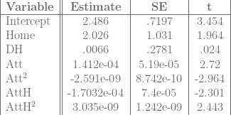
Methodology: Using data with, among other things, per-game run totals, win-loss data, and attendance, I’ll run three regressions. The first will be a linear probability model of the form

where 

As such, I’ll also run a Probit model of the same equation to avoid problems caused by the simplicity of the linear probability model.
Finally, just as a sanity check, I’ll run the same regression, but for runs, instead of win probability. Since runs aren’t binary, I’ll use ordinary least squares, and also control for the possibility that games played in American League parks lead to higher run totals by controlling for the designated hitter:

Since runs are a factor in winning, I have the same expectations about the signs of the beta values as above.
Results:
Regression 1 (Linear Probability Model):

So, my prediction about the attendance betas was incorrect, but only because I failed to account for the squared terms. The effect from home attendance increases as we approach full attendance; the effect from road attendance decreases at about the same rate. There’s still a net positive effect.
Regression 2 (Probit Model):

Note that in both cases, there’s a statistically significant 
Finally, the regression on runs:
Regression 3 (Predicted Runs):
Again, with runs, there is a statistically significant effect from being at home, and a variety of possible attendance effects. For low attendance values, the Home effect is probably swamped by the negative attendance effect, but for high attendance games, the Home effect probably outweighs the attendance effect or the attendance effect becomes positive.
Again, the Home effect is statistically significant no matter which model we use, so at least in the National League, there is a noticeable home field advantage.
Padre Differential July 11, 2011
Posted by tomflesher in Baseball, Economics.Tags: Baseball, baseball-reference.com, linear regression, National League, Padre Differential, Padres, Phillies, runs allowed, runs scored, statistics
1 comment so far
I was all set to fire up the Choke Index again this year. Unfortunately, Derek Jeter foiled my plan by making his 3000th hit right on time, so I can’t get any mileage out of that. Perhaps Jim Thome will start choking around #600 – but, frankly, I hope not. Since Jeter had such a callous disregard for the World’s Worst Sports Blog’s material, I’m forced to make up a new statistic.
This actually plays into an earlier post I made, which was about home field advantage for the Giants. It started off as a very simple regression for National League teams to see if the Giants’ pattern – a negative effect on runs scored at home, no real effect from the DH – held across the league. Those results are interesting and hold with the pattern that we’ll see below – I’ll probably slice them into a later entry.
The first thing I wanted to do, though, was find team effects on runs scored. Basically, I want to know how many runs an average team of Greys will score, how many more runs they’ll score at home, how many more runs they’ll score on the road if they have a DH, and then how many more runs the Phillies, the Mets, or any other team will score above their total. I’m doing this by converting Baseball Reference’s schedules and results for each team through their last game on July 10 to a data file, adding dummy variables for each team, and then running a linear regression of runs scored by each team against dummy variables for playing at home, playing with a DH, and the team dummies. In equation form,

For technical reasons, I needed to leave a team out, and so I chose the team that had the most negative coefficient: the Padres. Basically, then, the 

That is, the Padre Differential shows whether a team’s per-game run differential is higher or lower than the Padres’.
The table below shows each team in the National League, sorted by Padre Differential. By definition, San Diego’s Padre Differential is zero. ‘Sig95’ represents whether or not the value is statistically significant at the 95% level.

Unsurprisingly, the Phillies – the best team in baseball – have the highest Padre Differential in the league, with over 1.3 runs on average better than the Padres. Houston, in the cellar of the NL Central, is the worst team in the league and is .8 runs worse than the Padres per game. Florida and Chicago are both worse than the Padres and are both close to (Florida, 43) or below (Chicago, 37) the Padres’ 40-win total.
Take Your Base July 7, 2011
Posted by tomflesher in Baseball, Economics.Tags: hit batsman, hit batsmen, hit by pitch, Kevin Youkilis, statistics
add a comment
As usual, Kevin Youkilis is getting hit at an alarming rate this year. A quick check of his stats from Baseball Reference shows that from 2004 to 2010, he got hit at about a 2% clip and was intentionally walked about .5% of the time. This year, he’s been hit nine times in 340 plate appearances, for about 2.6% of plate appearances ending in the phrase “Take your base.” He’s only been intentionally walked once, which isn’t out of line from his three IBBs last year. In contrast, he was “only” hit ten times last year, so he’s one away from eclipsing that mark and six away from tying his record 15 times hit (in 2007). Interestingly, Kevin has never been hit in the postseason.
It would be oversimplistic to say that guys who get hit a lot get hit because they’re jerks. There’s a plausible argument that Youkilis’ unorthodox batting stance is responsible for his high rate, and some guys just get hit more often. Crashburn Alley makes the point that getting hit is a legitimate skill, and Plunk Everyone has a truly dizzying array of information about players getting hit. My question, though, is whether it could be the case that Youkilis is hit less often in the postseason because pitchers are more careful.
In 2007, 2008, and 2009, Youkilis made a total of 123 postseason plate appearances. During that time, he was never hit, nor was he intentionally walked. His OBP was .376, compared with a .397 regular-season OBP over those years. It’s possible that he was simply slumping and not seen as a threat.
It’s also possible that Youk’s failure to get hit at a respectable 2% rate (we’d have expected about 2 1/2 plunks) was simply chance. As a quick check, assume that his regular season stats during 2007, 2008, and 2009 represent “true” information, and that the 123 plate appearances he made in the postseasons were all random draws from the same distribution. Since he was hit 43 times in 1834 plate appearances across 2007-09, his true rate would be 2.3% (closer to 2.34, but I rounded down – note that this cuts Youk a little extra slack). Then, 95% of 123-appearance distributions should have hit-by-pitch rates that fall within the window

where se is the standard error, calculated as
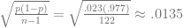
Thus, 95 out of 100 123-appearance runs should fall within the window

Obviously, since there can’t be a negative number of hit batsmen, zero is included in that interval. Youkilis isn’t necessarily being pitched around more effectively in the postseason – he’s just unlucky enough not to get plunked.
RBIs with Two Outs July 4, 2011
Posted by tomflesher in Baseball, Economics.Tags: Boone Logan, Daniel Murphy, Hector Noesi, Jason Bay, Mets, Ramiro Pena, RBIs, Scott Hairston, statistics, Subway Series, two-out RBIs, Yankees
add a comment
Sunday’s Subway Series game between the Mets and Yankees ended with a bang – Jason Bay hit a single off Hector Noesi that brought home Scott Hairston. The tenth inning should have been over, but Ramiro Pena committed an error at shortstop that put Daniel Murphy on base for Boone Logan. Hairston’s run was unearned, but no matter – Noesi took the loss and the Mets won the game.
The final score was 3-2, and the interesting thing about the game was that all three of the Mets’ runs came with two outs. (My fiancée, Katie, suggested that this was unusual, and motivated most of the rest of this post.) In fact, so far, the Mets have had 347 RBIs (of 375 runs scored), and 147 of them have come with two outs. That’s about 42.4% of their RBIs. By contrast, only 1070 of 3274 plate appearances – 32.7% – come with two outs. (Less than a third of plate appearances come with two outs because of the double play, among other reasons.) The majority come with no men out (about 34.8%) with the remainder coming with one out. It seems like the high concentration of 2-out RBIs should be explained by the use of the sacrifice bunt, but the Mets have only had 31 sacrifice bunts this season – not nearly enough to account for the difference between 32.7% of plate appearances and 42.4% of RBIs.
Is that pattern common across baseball? So far, there have been 10,037 RBIs in Major League Baseball in the 2011 season. 3686 of them – about 36.7% – came with two outs. Excluding the Mets’ numbers, that’s 3539 out of 9690, or 36.5%. For the National League only, there were 1928 two-out RBIS of 5212 total, or 37%, with 1781 of 4865 (36.6%) of National League RBIs coming with two outs if you exclude the Mets. (Note that I’m defining ‘in the National League’ as ‘in National League parks,’ since what I’m interested in is whether the Mets’ concentration of RBIs can be partially explained by the rules requiring pitchers to bat.)
Assume that the Mets’ RBIs are drawn from the same distribution as all others’. Then, 95% of the time, I’d expect the proportion of RBIs that come with two outs to be within two standard errors of the National League’s proportion, excluding the Mets. (The ‘two standard errors’ comes from the fact that a t-distribution’s critical value for a large number of trials for 95% significance is 1.96. For less than an infinite number, two standard errors is a handy approximation.) For the Mets’ 347 RBIs, the standard error would be

Thus, 95% of the time, the Mets should be within the interval of (.366 – .052, .366+.052), or (.314, .418). Since, again, the Mets’ proportion is .424, the Mets are slightly outside the 95% confidence interval. That’s pretty close, and certainly could happen by chance, but it’s surprising nonetheless. The question then is whether this is due to some sort of strategy employed by the Mets’ management or to some sort of clutch playing ability by the Mets. Again, there’s more data to collect and crunch (as always).
June Wins Above Expectation July 1, 2011
Posted by tomflesher in Baseball, Economics.Tags: Baseball, baseball-reference.com, statistics, wins above expectation
add a comment
Even though I’ve conjectured that team-level wins above expectation are more or less random, I’ve seen a few searches coming in over the past few days looking for them. With that in mind, I constructed a table (with ample help from Baseball-Reference.com) of team wins, losses, Pythagorean expectations, wins above expectation, and Alpha.
Quick definitions:
- The Pythagorean Expectation (pyth%) is a tool that estimates what percentage of games a team should have won based on that team’s runs scored and runs allowed. Since it generates a percentage, Pythagorean Wins (pythW) are estimated by multiplying the Pythagorean expectation by the number of games a team has played.
- Wins Above Expectation (WAE) are wins in excess of the Pythagorean expected wins. It’s hypothesized by some (including, occasionally, me) that WAE represents an efficiency factor – that is, they represent wins in games that the team “shouldn’t” have won, earned through shrewd management or clutch play. It’s hypothesized by others (including, occasionally, me) that WAE represent luck.
- Alpha is a nearly useless statistic representing the percentage of wins that are wins above expectation. Basically, W-L% = pyth% + Alpha. It’s an accounting artifact that will be useful in a long time series to test persistence of wins above expectation.
The results are not at all interesting. The top teams in baseball – the Yankees, Red Sox, Phillies, and Braves – have either negative WAE (that is, wins below expectation) or positive WAE so small that they may as well be zero (about 2 wins in the Phillies’ case and half a win in the Braves’). The Phillies’ extra two wins are probably a mathematical distortion due to Roy Halladay‘s two tough losses and two no-decisions in quality starts compared with only two cheap wins (and both of those were in the high 40s for game score). In fact, Phildaelphia’s 66-run differential, compared with the Yankees’ 115, shows the difference between the two teams’ scoring habits. The Phillies have the luxury of relying on low run production (they’ve produced about 78% of the Yankees’ production) due to their fantastic pitching. On the other hand, the Yankees are struggling with a 3.53 starters’ ERA including Ivan Nova and AJ Burnett, both over 4.00, as full-time starters. The Phillies have three pitchers with 17 starts and an ERA under 3.00 (Halladay, Cliff Lee, and Cole Hamels) and Joe Blanton, who has an ERA of 5.50, has only started 6 games. Even with Blanton bloating it, the Phillies’ starer ERA is only 2.88.
That doesn’t, though, make the Yankees a badly-managed team. In fact, there’s an argument that the Yankees are MORE efficient because they’re leading their league, just as the Phillies are, with a much worse starting rotation, through constructing a team that can balance itself out.
That’s the problem with wins above expectation – they lend themselves to multiple interpretations that all seem equally valid.
Tables are behind the cut. (more…)
Are This Year’s Home Runs Really That Different? December 22, 2010
Posted by tomflesher in Baseball, Economics.Tags: Carlos Pena, Carlos Quentin, home run distributions, home runs, Jose Bautista, kurtosis, Mark Teixeira, Miguel Cabrera, Paul Konerko, R, skewness, statistics
add a comment
 This year’s home runs are quite confounding. On the one hand, home runs per game in the AL have dropped precipitously (as noted and examined in the two previous posts). On the other hand, Jose Bautista had an absolutely outstanding year. How much different is this year’s distribution than those of previous years? To answer that question, I took off to Baseball Reference and found the list of all players with at least one plate appearance, sorted by home runs.
There are several parameters that are of interest when discussing the distribution of events. Th e first is the mean. This year’s mean was 5.43, meaning that of the players with at least one plate appearance, on average each one hit 5.43 homers. That’s down from 6.53 last year and 5.66 in 2008.
Next, consider the variance and standard deviation. (The variance is the standard deviation squared, so the numbers derive similarly.) A low variance means that the numbers are clumped tightly around the mean. This year’s variance was 68.4, down from last year’s 84.64 but up from 2008’s 66.44.
The skewness and kurtosis represent the length and thickness of the tails, respectively. Since a lot of people have very  few home runs, the skewness of every year’s distribution is going to be positive. Roughly, that means that there are observations far larger than the mean, but very few that are far smaller. That makes sense, since there’s no such thing as a negative home run total. The kurtosis number represents how pointy the distribution is, or alternatively how much of the distribution is found in the tail.
For example, in 2009, Mark Teixeira and Carlos Pena jointly led the American League in home runs with 39. There was a high mean, but the tail was relatively thin with a  high variance. Compared with this year, when Bautista led his nearest competitor (Paul Konerko) by 15 runs and only 8 players were over 30 home runs, 2009 saw 15 players above 30 home runs with a pretty tight race for the lead. Kurtosis in 2010 was 7.72 compared with 2009’s 4.56 and 2008’s 5.55. (In 2008, 11 players were above the 30-mark, and Miguel Cabrera‘s 37 home runs edged Carlos Quentin by just one.)
The numbers say that 2008 and 2009 were much more similar than either of them is to 2010. A quick look at the distributions bears that out – this was a weird year.
