How has hitting changed this year? Evidence from the first half of 2017 August 22, 2017
Posted by tomflesher in Baseball.Tags: Baseball, binomial distribution, home runs, MLB, probability, Stuff Gary Cohen Says
3 comments
It’s no secret that MLB hitters are hitting more home runs this year. In June, USA Today’s Ted Berg called the uptick “so outrageous and so unprecedented” as to require additional examination, and he offered a “juiced” ball as a possibility (along with “juiced” players and statistical changes to players’ approaches). DJ Gallo noted a “strange ambivalence” toward the huge increase in home runs, and June set a record for the most home runs in a month. Neil Greenberg makes a convincing case that the number of homers is due to better understanding of the physics of hitting.
How big a shift are we talking about here? Well, take a look at the numbers from 2016’s first half. (That’s defined as games before the All-Star Game.) That comprises 32670 games and 101450 plate appearances. In that time period, hitters got on base at a .323 clip. About 65% of hits were singles, with 19.6% doubles, 2.09% triples, and 13.2% home runs. Home runs came in about 3.04% of plate appearances (3082 home runs in 101450 plate appearances).

Using 2016’s rate, 2017’s home run count is basically impossible.
Taking that rate as our prior, how different are this year’s numbers? For one, batters are getting on base only a little more – the league’s OBP is .324 – but hitting more extra-base hits every time. Only 63.7% of hits in the first year were singles, with 19.97% of hits landing as doubles, 1.78% triples, and 14.5% home runs. There were incidentally, more homers (3343) in fewer plate appeances (101269). Let’s assume for the moment that those numbers are significantly different from last year – that the statistical fluctuation isn’t due to weather, “dumb luck,” or anything else, but has to be due to some internal factor. There weren’t that many extra hits – again, OBP only increased by .001 – but the distribution of hits changed noticeably. Almost all of the “extra” hits went to the home run column, rather than more hits landing as singles or doubles.
In fact, there were more fly balls this year – the leaguewide grounder-to-flyer ratio fell from .83 in 2016 to .80 this year. That still doesn’t explain everything, though, since the percentage of fly balls that went out of the park rose from 9.2% to 10%. (Note that those are yearlong numbers, not first-half specific.) Not only are there more fly balls, but more of them are leaving the stadium as home runs. The number of fly balls on the infield has stayed steady at 12%, and although there are slightly more walks (8.6% this year versus 8.2% last year), the strikeout rate rose by about the same number (21.5% this year, 21.1% last year).
Using last year’s rate of 3082 homers per 101450 plate appearances, I simulated 100,000 seasons each consisting of 101269 plate appearances – the number of appearances made in the first half of 2017. To keep the code simple, I recorded only the number of home runs in each season. If the rates were the same, the numbers would be clustered around 3077. In fact, in those 100,000 seasons, the median and mean were both 3076, and the distribution shown above has a clear peak in that region. Note in the bottom right corner, the distribution’s tail basically disappears above 3300; in those 100,000 seasons, the most home runs recorded was 3340 – 3 fewer than this year’s numbers. In fact, the probability of having LESS than 3343 home runs is 0.9999992. If everything is the same as last year, the probability of this year’s home runs occurring simply by chance is .0000008, or roughly 8 in 10 million.
Home runs and non-homer RBIs May 31, 2016
Posted by tomflesher in Baseball.Tags: home runs, Neil Walker, RBIs, weird lines
add a comment
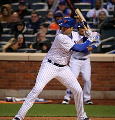
Neil Walker. Photo: Arturo Pardavila III via Wikimedia Commons.
While at yesterday’s Mets game, a friend of mine pointed out that Neil Walker had a surprisingly high ratio of home runs to RBIs – at the time, it was 12 homers to 23 RBIs, or a ratio of about .522 homers per RBI. That boils down to Walker hitting a ton of solo homers, including the only run scored in yesterday’s game. True, a lot of that is because Yoenis Cespedes tends to clear the bases before Walker gets a chance to drive in the runners, but that does beg the question – what does the typical hitter’s ratio look like?
Of players with 150 plate appearances or more, the surprise leader isn’t Walker, but Curtis Granderson. As a leadoff hitter, that makes sense: he gets more chances than Walker to hit homers with no one one, since he gets an opportunity every game. Grandy’s hit four homers to open the first inning and 5 midgame, including his walkoff against Pedro Baez.
As a curiosity, there are seven qualified batters who have no home runs this season: Cesar Hernandez, Billy Burns, Francisco Cervelli, Austin Jackson, Erick Aybar, Alcides Escobar, and Martin Prado. Escobar is bringing up the rear with 230 plate appearances. Of the top 10 players in HR per RBI, only Walker and Giancarlo Stanton are in the double digits for home runs (each with 12).
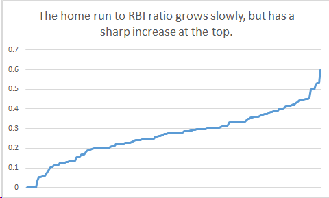
The home-run-to-RBI ratio of all batters with 150 plate appearances, as of May 30.
Unsurprisingly, there’s a strong correlation (ρ = 0.78) between HR/RBI and number of home runs; longball hitters tend to hit them whether there are runners on base or not. Probably the strongest statistical interpretation we can offer here is that RBIs are a pretty lousy way to evaluate hitters; they contain little information that simply measuring home runs, slugging average (ρ = 0.46) or OPS (ρ = 0.315) doesn’t offer.
It’s possible that a high HR/RBI ratio would indicate that a batter performs poorly in the clutch: the player doesn’t hit homers with men on base. In order to justify that interpretation, though, we’d need significantly more evidence and to do some statistical testing to see if he really did hit differently with runners in scoring position than without. It may be that, like Walker, there just aren’t that many opportunities. The only time this seems to be a red flag statistic would be for a hitter who plays with a team full of high-OBP, low-SLG hitters, indicating that there are usually men on base and he doesn’t drive them home. Otherwise, for guys like Walker and Stanton, it’s just a fun eye-bugging stat.
Home Runs Per Game: A bit more in-depth December 23, 2011
Posted by tomflesher in Baseball, Economics.Tags: AR, autoregression, baseball-reference.com, home runs, home runs per plate appearance, linear regression, talent pool dilution
add a comment
I know I’ve done this one before, but in my defense, it was a really bad model.
I made some odd choices in modeling run production in that post. The first big questionable choice was to detrend according to raw time. That might make sense starting with a brand-new league, where we’d expect players to be of low quality and asymptotically approach a true level of production – a quadratic trend would be an acceptable model of dynamics in that case. That’s not a sensible way to model the major leagues, though; even though there’s a case to be made that players being in better physical condition will lead to better production, there’s no theoretical reason to believe that home run production will grow year over year.
So, let’s cut to the chase: I’m trying to capture a few different effects, and so I want to start by running a linear regression of home runs on a couple of controlling factors. Things I want to capture in the model:
- The DH. This should have a positive effect on home runs per game.
- Talent pool dilution. There are competing effects – more batters should mean that the best batters are getting fewer plate appearances, as a percentage of the total, but at the same time, more pitchers should mean that the best pitchers are facing fewer batters as a percentage of the total. I’m including three variables: one for the number of batters and one for the number of pitchers, to capture those effects individually, and one for the number of teams in the league. (All those variables are in natural logarithm form, so the interpretation will be that a 1% change in the number of batters, pitchers, or teams will have an effect on home runs.) The batting effect should be negative (more batters lead to fewer home runs); the pitching effect should be positive (more pitchers mean worse pitchers, leading to more home runs); the team effect could go either way, depending on the relative strengths of the effects.
- Trends in strategy and technology. I can’t theoretically justify a pure time trend, but I also can’t leave out trends entirely. Training has improved. Different training regimens become popular or fade away, and some strategies are much different than in previous years. I’ll use an autoregressive process to model these.
My dependent variable is going to be home runs per plate appearance. I chose HR/PA for two reasons:
- I’m using Baseball Reference’s AL and NL Batting Encyclopedias, which give per-game averages; HR per game/PA per game will wash out the per-game adjustments.
- League HR/PA should show talent pool dilution as noted above – the best hitters get the same plate appearances but their plate appearances will make up a smaller proportion of the total. I’m using the period from 1955 to 2010.
After dividing home runs per game by plate appearances per game, I used R to estimate an autoregressive model of home runs per plate appearance. That measures whether a year with lots of home runs is followed by a year with lots of home runs, whether it’s the reverse, or whether there’s no real connection between two consecutive years. My model took the last three years into account:

Since the model doesn’t fit perfectly, there will be an “error” term, 

The results:

The DH and batter effects aren’t statistically different from zero, surprisingly; the pitching effect and the team effect are both significant at the 95% level. Interestingly, the team effect and the pitching effect have opposite signs, meaning that there’s some factor in increasing the number of teams that doesn’t relate purely to pitching or batting talent pool dilution.
For the record, fitted values of innovations correlate fairly highly with HR/PA: the correlation is about .70, despite a pretty pathetic R-squared of .08.
Teixeira’s Ability to Pick Up Slack: Re-Evaluating April 12, 2011
Posted by tomflesher in Baseball, Economics.Tags: Alex Rodriguez, binomial distribution, home runs, Mark Teixeira, Michael Kaye, Robinson Cano, Yankees
add a comment
In an earlier post, I discussed Yankees broadcaster Michael Kaye’s belief that Mark Teixeira and Robinson Cano were picking up slack during the time in which Alex Rodriguez was struggling to hit his 600th home run. I noticed that Teixeira had hit 18 home runs in 423 plate appearances during the first 93 games of the season for rates of .194 home runs per game and .0426 home runs per plate appearance. During the time between A-Rod’s #599 and #600, Teixeira’s performance was different in a statistically significant way: his production per game was up to .417 home runs per game and .0926 home runs per plate appearance.
Now, let’s take a look at the home stretch of the season. Teixeira played in 52 games, starting 51 of them, and hit 10 home runs in 230 plate appearances. That works out to .1923 home runs per game or .0435 per plate appearance. Those numbers are exceptionally similar to Teixeira’s production in the first stretch of the season, so it seems reasonable to say that those rates represent his standard rate of production.
This is prima facie evidence that Teixeira was working to hit more home runs, consciously or subconsciously, during the time that Rodriguez was struggling. The question then becomes, is there a reason to expect production to increase during the stretch between late July and early August? What if Mark was just operating better following the All-Star Break?
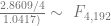
I chose a twelve-game stretch immediately following the All-Star Break to evaluate. This period overlaps with the drought between A-Rod’s 599th and 600th home runs, stretching from July 16 to July 28, so six games overlap and six do not. During that time, Teixeira hit 3 home runs in 56 plate appearances. His rate was therefore .0535 home runs per plate appearance.
If we assume that Teixeira’s true rate of production is about .043 home runs per plate appearance (his average over the season, excluding the drought), then the probability of his hitting exactly 3 home runs in a random 56-plate-appearance stretch is

He has a 43% chance of hitting 3 or more, compared with the complementary probability 57% probability of hitting fewer than 3. It’s well within the normal expected range. So, the All-Star Break effect is unlikely to explain Teixeira’s abnormal production last July.
Are This Year’s Home Runs Really That Different? December 22, 2010
Posted by tomflesher in Baseball, Economics.Tags: Carlos Pena, Carlos Quentin, home run distributions, home runs, Jose Bautista, kurtosis, Mark Teixeira, Miguel Cabrera, Paul Konerko, R, skewness, statistics
add a comment
 This year’s home runs are quite confounding. On the one hand, home runs per game in the AL have dropped precipitously (as noted and examined in the two previous posts). On the other hand, Jose Bautista had an absolutely outstanding year. How much different is this year’s distribution than those of previous years? To answer that question, I took off to Baseball Reference and found the list of all players with at least one plate appearance, sorted by home runs.
There are several parameters that are of interest when discussing the distribution of events. Th e first is the mean. This year’s mean was 5.43, meaning that of the players with at least one plate appearance, on average each one hit 5.43 homers. That’s down from 6.53 last year and 5.66 in 2008.
Next, consider the variance and standard deviation. (The variance is the standard deviation squared, so the numbers derive similarly.) A low variance means that the numbers are clumped tightly around the mean. This year’s variance was 68.4, down from last year’s 84.64 but up from 2008’s 66.44.
The skewness and kurtosis represent the length and thickness of the tails, respectively. Since a lot of people have very  few home runs, the skewness of every year’s distribution is going to be positive. Roughly, that means that there are observations far larger than the mean, but very few that are far smaller. That makes sense, since there’s no such thing as a negative home run total. The kurtosis number represents how pointy the distribution is, or alternatively how much of the distribution is found in the tail.
For example, in 2009, Mark Teixeira and Carlos Pena jointly led the American League in home runs with 39. There was a high mean, but the tail was relatively thin with a  high variance. Compared with this year, when Bautista led his nearest competitor (Paul Konerko) by 15 runs and only 8 players were over 30 home runs, 2009 saw 15 players above 30 home runs with a pretty tight race for the lead. Kurtosis in 2010 was 7.72 compared with 2009’s 4.56 and 2008’s 5.55. (In 2008, 11 players were above the 30-mark, and Miguel Cabrera‘s 37 home runs edged Carlos Quentin by just one.)
The numbers say that 2008 and 2009 were much more similar than either of them is to 2010. A quick look at the distributions bears that out – this was a weird year.
What Happened to Home Runs This Year? December 22, 2010
Posted by tomflesher in Baseball, Economics.Tags: baseball-reference.com, forecasting, home runs, R, regression, standard error, statistics, time series, Year of the Pitcher
1 comment so far
I was talking to Jim, the writer behind Apparently, I’m An Angels Fan, who’s gamely trying to learn baseball because he wants to be just like me. Jim wondered aloud how much the vaunted “Year of the Pitcher” has affected home run production. Sure enough, on checking the AL Batting Encyclopedia at Baseball-Reference.com, production dropped by about .15 home runs per game (from 1.13 to .97). Is that normal statistical variation or does it show that this year was really different?
In two previous posts, I looked at the trend of home runs per game to examine Stuff Keith Hernandez Says and then examined Japanese baseball’s data for evidence of structural break. I used the Batting Encyclopedia to run a time-series regression for a quadratic trend and added a dummy variable for the Designated Hitter. I found that the time trend and DH control account for approximately 56% of the variation in home runs per year, and that the functional form is

with t=1 in 1955, t=2 in 1956, and so on. That means t=56 in 2010. Consequently, we’d expect home run production per game in 2010 in the American League to be approximately

That means we expected production to increase this year and it dropped precipitously, for a residual of -.28. The residual standard error on the original regression was .1092, so on 106 degrees of freedom, so the t-value using Texas A&M’s table is 1.984 (approximating using 100 df). That means we can be 95% confident that the actual number of home runs should fall within .1092*1.984, or about .2041, of the expected value. The lower bound would be about 1.05, meaning we’re still significantly below what we’d expect. In fact, the observed number is about 3.4 standard errors below the expected number. In other words, we’d expect that to happen by chance less than .1% (that is, less than one tenth of one percent) of the time.
Clearly, something else is in play.
Home Run Derby: Does it ruin swings? December 15, 2010
Posted by tomflesher in Baseball, Economics.Tags: Baseball, baseball-reference.com, Chris Young, Corey Hart, David Ortiz, Hanley Ramirez, home run derby, home runs, Matt Holliday, Miguel Cabrera, Nick Swisher, Vernon Wells
add a comment
Earlier this year, there was a lot of discussion about the alleged home run derby curse. This post by Andy on Baseball-Reference.com asked if the Home Run Derby is bad for baseball, and this Hardball Times piece agrees with him that it is not. The standard explanation involves selection bias – sure, players tend to hit fewer home runs in the second half after they hit in the Derby, but that’s because the people who hit in the Derby get invited to do so because they had an abnormally high number of home runs in the first half.
Though this deserves a much more thorough macro-level treatment, let’s just take a look at the density of home runs in either half of the season for each player who participated in the Home Run Derby. Those players include David Ortiz, Hanley Ramirez, Chris Young, Nick Swisher, Corey Hart, Miguel Cabrera, Matt Holliday, and Vernon Wells.
For each player, plus Robinson Cano (who was of interest to Andy in the Baseball-Reference.com post), I took the percentage of games before the Derby and compared it with the percentage of home runs before the Derby. If the Ruined Swing theory holds, then we’d expect

The table below shows that in almost every case, including Cano (who did not participate), the density of home runs in the pre-Derby games was much higher than the post-Derby games.
| Player | HR Before | HR Total | g(Games) | g(HR) | Diff |
| Ortiz | 18 | 32 | 0.54321 | 0.5625 | 0.01929 |
| Hanley | 13 | 21 | 0.54321 | 0.619048 | 0.075838 |
| Swisher | 15 | 29 | 0.537037 | 0.517241 | -0.0198 |
| Wells | 19 | 31 | 0.549383 | 0.612903 | 0.063521 |
| Holliday | 16 | 28 | 0.54321 | 0.571429 | 0.028219 |
| Hart | 21 | 31 | 0.549383 | 0.677419 | 0.128037 |
| Cabrera | 22 | 38 | 0.530864 | 0.578947 | 0.048083 |
| Young | 15 | 27 | 0.549383 | 0.555556 | 0.006173 |
| Cano | 16 | 29 | 0.537037 | 0.551724 | 0.014687 |
Is this evidence that the Derby causes home run percentages to drop off? Certainly not. There are some caveats:
- This should be normalized based on games the player played, instead of team games.
- It would probably even be better to look at a home run per plate appearance rate instead.
- It could stand to be corrected for deviation from the mean to explain selection bias.
- Cano’s numbers are almost identical to Swisher’s. They play for the same team. If there was an effect to be seen, it would probably show up here, and it doesn’t.
Once finals are up, I’ll dig into this a little more deeply.
600 Home Runs: Who’s Second? July 25, 2010
Posted by tomflesher in Baseball, Economics.Tags: 600 home runs, Alex Rodriguez, binomial distribution, Dodgers, home runs, Jim Thome, Manny Ramirez, quick and dirty stats, Twins
1 comment so far
Alex Rodriguez is, as I’m writing this, sitting at 599 home runs. Almost certainly, he’ll be the next player to hit the 600 home-run milestone, since the next two active players are Jim Thome at 575 and Manny Ramirez at 554. Today’s Toyota Text Poll (which runs during Yankee games on YES) asked which of those two players would reach #600 sooner.
There are a few levels of abstraction to answering this question. First of all, without looking at the players’ stats, Thome gets the nod at the first order because he’s significantly closer than Driving in 25 home runs is easier than driving in 46, so Thome will probably get there first.
At the second order, we should take a look at the players’ respective rates. Over the past two seasons, Thome has averaged a rate of .053 home runs per plate appearance, while Ramirez has averaged .041 home runs per plate appearance. With fewer home runs to hit and a higher likelihood of hitting one each time he makes it to the plate, Thome stays more likely to hit #600 before Ramirez does… but how much more likely?
Using the binomial distribution, I tested the likelihood that each player would hit his required number of home runs in different numbers of plate appearances to see where that likelihood reached a maximum. For Thome, the probability increases until 471 plate appearances, then starts decreasing, so roughly, I expect Thome to hit his 25th home run within 471 plate appearances. For Manny, that maximum doesn’t occur until 1121 plate appearances. Again, the nod has to go to Thome. He’ll probably reach the milestone in less than half as many plate appearances.
But wait. How many plate appearances is that, anyway? Until recently, Manny played 80-90% of the games in a season. Last year, he played 64%. So far the Dodgers have played 99 games and Manny appeared in 61 of them, but of course he’s disabled this year. Let’s make the generous assumption that Manny will play in 75% of the games in each season starting with this one. Then, let’s look at his average plate appearances per game. For most of his career, he averaged between 4.1 and 4.3 plate appearances per game, but this year he’s down to 3.6. Let’s make the (again, generous) assumption that he’ll get 4 plate appearances in each game from now on. At that rate, to get 1121 plate appearances, he needs to play in 280.25 games, which averages to 1.723 seasons of 162 games or about 2.62 seasons of 75% playing time.
Thome, on the other hand, has consistently played in 80% or more of his team’s games but suffered last year and this year because he hasn’t been serving as an everyday player. He pinch-hit in the National League last year and has, in Minnesota, played in about 69% of the games averaging only 3 plate appearances in each. Let’s give Jim the benefit of the doubt and assume that from here on out he’ll hit in 70% of the games and get 3.5 appearances (fewer games and fewer appearances than Ramirez). He’d need about 120.3 games, which equates to about 3/4 of a 162-game season or about 1.06 seasons with 70% playing time. Even if we downgrade Thome to 2.5 PA per game and 66% playing time, that still gives us an expectation that he’ll hit #600 within the next 1.6 real-time seasons.
Since Thome and Ramirez are the same age, there’s probably no good reason to expect one to retire before the other, and they’ll probably both be hitting as designated hitters in the AL next year. As a result, it’s very fair to expect Thome to A) reach 600 home runs and B) do it before Manny Ramirez.
More on Home Runs Per Game July 9, 2010
Posted by tomflesher in Baseball, Economics.Tags: Baseball, baseball-reference.com, Chow test, home runs, Japan, Japanese baseball, R, Rays, regression, replication
add a comment
In the previous post, I looked at the trend in home runs per game in the Major Leagues and suggested that the recent deviation from the increasing trend might have been due to the development of strong farm systems like the Tampa Bay Rays’. That means that if the same data analysis process is used on data in an otherwise identical league, we should see similar trends but no dropoff around 1995. As usual, for replication purposes I’m going to use Japan’s Pro Baseball leagues, the Pacific and Central Leagues. They’re ideal because, just like the American Major Leagues, one league uses the designated hitter and one does not. There are some differences – the talent pool is a bit smaller because of the lower population base that the leagues draw from, and there are only 6 teams in each league as opposed to MLB’s 14 and 16.
As a reminder, the MLB regression gave us a regression equation of

where 
Just examining the data on home runs per game from the Japanese leagues, the trend looks significantly differe nt. Instead of the rough U-shape that the MLB data showed, the Japanese data looks almost M-shaped with a maximum around 1984. (Why, I’m not sure – I’m not knowledgeable enough about Japanese baseball to know what might have caused that spike.) It reaches a minimum again and then keeps rising.
After running the same regression with t=1 in 1950, I got these results:
| Estimate | Std. Error | t-value | p-value | Signif | |
| B0 | 0.2462 | 0.0992 | 2.481 | 0.0148 | 0.9852 |
| t | 0.0478 | 0.0062 | 7.64 | 1.63E-11 | 1 |
| tsq | -0.0006 | 0.00009 | -7.463 | 3.82E-11 | 1 |
| DH | 0.0052 | 0.0359 | 0.144 | 0.8855 | 0.1145 |
This equation shows two things, one that surprises me and one that doesn’t. The unsurprising factor is the switching of signs for the t variables – we expected that based on the shape of the data. The surprising factor is that the designated hitter rule is insignificant. We can only be about 11% sure it’s significant. In addition, this model explains less of the variation than the MLB version – while that explained about 56% of the variation, the Japanese model has an 
There’s a slightly interesting pattern to the residual home runs per game (
 it isn’t as pronounced, this data also shows a spike – but the spike is at t=55, so instead of showing up in 1995, the Japan leagues spiked around the early 2000s. Clearly the same effect is not in play, but why might the Japanese leagues see the same effect later than the MLB teams? It can’t be an expansion effect, since the Japanese leagues have stayed constant at 6 teams since their inception.
Incidentally, the Japanese league data is heteroskedastic (Breusch-Pagan test p-value .0796), so it might be better modeled using a generalized least squares formula, but doing so would have skewed the results of the replication.
In order to show that the parameters really are different, the appropriate test is Chow’s test for structural change. To clean it up, I’m using only the data from 1960 on. (It’s quick and dirty, but it’ll do the job.) Chow’s test takes

where 


The critical value for 90% significance at 4 and 192 degrees of freedom would be 1.974 according to Texas A&M’s F calculator. That means we don’t have enough evidence that the parameters are different to treat them differently. This is probably an artifact of the small amount of data we have.
In the previous post, I looked at the trend in home runs per game in the Major Leagues and suggested that the recent deviation from the increasing trend might have been due to the development of strong farm systems like the Tampa Bay Rays’. That means that if the same data analysis process is used on data in an otherwise identical league, we should see similar trends but no dropoff around 1995. As usual, for replication purposes I’m going to use Japan’s Pro Baseball leagues, the Pacific and Central Leagues. They’re ideal because, just like the American Major Leagues, one league uses the designated hitter and one does not. There are some differences – the talent pool is a bit smaller because of the lower population base that the leagues draw from, and there are only 6 teams in each league as opposed to MLB’s 14 and 16.
As a reminder, the MLB regression gave us a regression equation of

where 
Just examining the data on home runs per game from the Japanese leagues, the trend looks significantly different. Instead of the rough U-shape that the MLB data showed, the Japanese data looks almost M-shaped with a maximum around 1984. (Why, I’m not sure – I’m not knowledgeable enough about Japanese baseball to know what might have caused that spike.) It reaches a minimum again and then keeps rising.
After running the same regression with t=1 in 1950, I got these results:
| Estimate | Std. Error | t-value | p-value | Signif | |
| B0 | 0.2462 | 0.0992 | 2.481 | 0.0148 | 0.9852 |
| t | 0.0478 | 0.0062 | 7.64 | 1.63E-11 | 1 |
| tsq | -0.0006 | 0.00009 | -7.463 | 3.82E-11 | 1 |
| DH | 0.0052 | 0.0359 | 0.144 | 0.8855 | 0.1145 |
This equation shows two things, one that surprises me and one that doesn’t. The unsurprising factor is the switching of signs for the t variables – we expected that based on the shape of the data. The surprising factor is that the designated hitter rule is insignificant. We can only be about 11% sure it’s significant. In addition, this model explains less of the variation than the MLB version – while that explained about 56% of the variation, the Japanese model has an 
There’s a slightly interesting pattern to the residual home runs per game ( it isn’t as pronounced, this data also shows a spike – but the spike is at t=55, so instead of showing up in 1995, the Japan leagues spiked around the early 2000s. Clearly the same effect is not in play, but why might the Japanese leagues see the same effect later than the MLB teams? It can’t be an expansion effect, since the Japanese leagues have stayed constant at 6 teams since their inception.
Incidentally, the Japanese league data is heteroskedastic (Breusch-Pagan test p-value .0796), so it might be better modeled using a generalized least squares formula, but doing so would have skewed the results of the replication.
In order to show that the parameters really are different, the appropriate test is Chow’s test for structural change. To clean it up, I’m using only the data from 1960 on. (It’s quick and dirty, but it’ll do the job.) Chow’s test takes
)/(k)}{(S_1+S_2)/(N_1+N_2-2k)} ~ F")
Back when it was hard to hit 55… July 8, 2010
Posted by tomflesher in Baseball, Economics.Tags: Baseball, baseball-reference.com, home runs, R, regression, sabermetrics, Stuff Keith Hernandez Says, talent pool dilution, Willie Mays, Year of the Pitcher
add a comment
Last night was one of those classic Keith Hernandez moments where he started talking and then stopped abruptly, which I always like to assume is because the guys in the truck are telling him to shut the hell up. He was talking about Willie Mays for some reason, and said that Mays hit 55 home runs “back when it was hard to hit 55.” Keith coyly said that, while it was easy for a while, it was “getting hard again,” at which point he abruptly stopped talking.
Keith’s unusual candor about drug use and Mays’ career best of 52 home runs aside, this pinged my “Stuff Keith Hernandez Says” meter. After accounting for any time trend and other factors that might explain home run hitting, is there an upward trend? If so, is there a pattern to the remaining home runs?
The first step is to examine the data to see if there appears to be any trend. Just looking at it, there appears to be a messy U shape with a minimum around t=20, which indicates a quadratic trend. That means I want to include a term for time and a term for time squared.
Using the per-game averages for home runs from 1955 to 2009, I detrended the data using t=1 in 1955. I also had to correct for the effect of the designated hitter. That gives us an equation of the form

The results:
| Estimate | Std. Error | t-value | p-value | Signif | |
| B0 | 0.957 | 0.0328 | 29.189 | 0.0001 | 0.9999 |
| t | -0.0188 | 0.0028 | -6.738 | 0.0001 | 0.9999 |
| tsq | 0.0004 | 0.00005 | 8.599 | 0.0001 | 0.9999 |
| DH | 0.0911 | 0.0246 | 3.706 | 0.0003 | 0.9997 |
We can see that there’s an upward quadratic trend in predicted home runs that together with the DH rule account for about 56% of the variation in the number of home runs per game in a season (
Then, I needed to look at the difference between the predicted number of home runs per game and the actual number of home runs per game, which is accessible by subtracting

This represents the “abnormal” number of home runs per year. The question then becomes, “Is there a patt ern to the number of abnormal home runs?” There are two ways to answer this. The first way is to look at the abnormal home runs. Up until about t=40 (the mid-1990s), the abnormal home runs are pretty much scattershot above and below 0. However, at t=40, the residual jumps up for both leagues and then begins a downward trend. It’s not clear what the cause of this is, but the knee-jerk reaction is that there might be a drug use effect. On the other hand, there are a couple of other explanations.
The most obvious is a boring old expansion effect. In 1993, the National League added two teams (the Marlins and the Rockies), and in 1998 each league added a team (the AL’s Rays and the NL’s Diamondbacks). Talent pool dilution has shown up in our discussion of hit batsmen, and I believe that it can be a real effect. It would be mitigated over time, however, by the establishment and development of farm systems, in particular strong systems like the one that’s producing good, cheap talent for the Rays.
