Is scoring different in the AL and the NL? May 31, 2011
Posted by tomflesher in Baseball, Economics.Tags: American League, Baseball, baseball-reference.com, bunts, Chow test, linear regression, National League, R, structural break
1 comment so far
The American League and the National League have one important difference. Specifically, the AL allows the use of a player known as the Designated Hitter, who does not play a position in the field, hits every time the pitcher would bat, and cannot be moved to a defensive position without forfeiting the right to use the DH. As a result, there are a couple of notable differences between the AL and the NL – in theory, there should be slightly more home runs and slightly fewer sacrifice bunts in the AL, since pitchers have to bat in the NL and they tend to be pretty poor hitters. How much can we quantify that difference? To answer that question, I decided to sample a ten-year period (2000 until 2009) from each league and run a linear regression of the form

Where runs are presumed to be a function of hits, doubles, triples, home runs, stolen bases, times caught stealing, walks, strikeouts, hit batsmen, bunts, and sacrifice flies. My expectations are:
- The sacrifice bunt coefficient should be smaller in the NL than in the AL – in the American League, bunting is used strategically, whereas NL teams are more likely to bunt whenever a pitcher appears, so in any randomly-chosen string of plate appearances, the chance that a bunt is the optimal strategy given an average hitter is much lower. (That is, pitchers bunt a lot, even when a normal hitter would swing away.) A smaller coefficient means each bunt produces fewer runs, on average.
- The strategy from league to league should be different, as measured by different coefficients for different factors from league to league. That is, the designated hitter rule causes different strategies to be used. I’ll use a technique called the Chow test to test that. That means I’ll run the linear model on all of MLB, then separately on the AL and the NL, and look at the size of the errors generated.
The results:
- In the AL, a sac bunt produces about .43 runs, on average, and that number is significant at the 95% level. In the NL, a bunt produces about .02 runs, and the number is not significantly different from saying that a bunt has no effect on run production.
- The Chow Test tells us at about a 90% confidence level that the process of producing runs in the AL is different than the process of producing runs in the NL. That is, in Major League Baseball, the designated hitter has a statistically significant effect on strategy. There’s structural break.
R code is behind the cut.
Are This Year’s Home Runs Really That Different? December 22, 2010
Posted by tomflesher in Baseball, Economics.Tags: Carlos Pena, Carlos Quentin, home run distributions, home runs, Jose Bautista, kurtosis, Mark Teixeira, Miguel Cabrera, Paul Konerko, R, skewness, statistics
add a comment
 This year’s home runs are quite confounding. On the one hand, home runs per game in the AL have dropped precipitously (as noted and examined in the two previous posts). On the other hand, Jose Bautista had an absolutely outstanding year. How much different is this year’s distribution than those of previous years? To answer that question, I took off to Baseball Reference and found the list of all players with at least one plate appearance, sorted by home runs.
There are several parameters that are of interest when discussing the distribution of events. Th e first is the mean. This year’s mean was 5.43, meaning that of the players with at least one plate appearance, on average each one hit 5.43 homers. That’s down from 6.53 last year and 5.66 in 2008.
Next, consider the variance and standard deviation. (The variance is the standard deviation squared, so the numbers derive similarly.) A low variance means that the numbers are clumped tightly around the mean. This year’s variance was 68.4, down from last year’s 84.64 but up from 2008’s 66.44.
The skewness and kurtosis represent the length and thickness of the tails, respectively. Since a lot of people have very  few home runs, the skewness of every year’s distribution is going to be positive. Roughly, that means that there are observations far larger than the mean, but very few that are far smaller. That makes sense, since there’s no such thing as a negative home run total. The kurtosis number represents how pointy the distribution is, or alternatively how much of the distribution is found in the tail.
For example, in 2009, Mark Teixeira and Carlos Pena jointly led the American League in home runs with 39. There was a high mean, but the tail was relatively thin with a  high variance. Compared with this year, when Bautista led his nearest competitor (Paul Konerko) by 15 runs and only 8 players were over 30 home runs, 2009 saw 15 players above 30 home runs with a pretty tight race for the lead. Kurtosis in 2010 was 7.72 compared with 2009’s 4.56 and 2008’s 5.55. (In 2008, 11 players were above the 30-mark, and Miguel Cabrera‘s 37 home runs edged Carlos Quentin by just one.)
The numbers say that 2008 and 2009 were much more similar than either of them is to 2010. A quick look at the distributions bears that out – this was a weird year.
Diagnosing the AL December 22, 2010
Posted by tomflesher in Baseball, Economics.Tags: 2010, American League, baseball-reference.com, R, regression, statistics, Year of the Pitcher
add a comment
In the previous post, I crunched some numbers on a previous forecast I’d made and figured out that it was a pretty crappy forecast. (That’s the fun of forecasting, of course – sometimes you’re right and sometimes you’re wrong.) The funny part of it, though, is that the predicted home runs per game for the American League was so far off – 3.4 standard errors below the predicted value – that it’s highly unlikely that the regression model I used controls for all relevant variables. That’s not surprising, since it was only a time trend with a dummy variable for the designated hitter.
There are a couple of things to check for immediately. The first is the most common explanation thrown around when home runs drop – steroids. It seems to me that if the drop in home runs were due to better control of performance-enhancing drugs, then it should mostly be home runs that are affected. For example, intentional walks should probably be below expectation, since intentional walks are used to protect against a home run hitter. Unintentional walks should probably be about as expected, since walks are a function of plate discipline and pitcher control, not of strength. On-base percentage should probably drop at a lower magnitude than home runs, since some hits that would have been home runs will stay in the park as singles, doubles, or triples rather than all being fly-outs. There will be a drop but it won’t be as big. Finally, slugging average should drop because a loss in power without a corresponding increase in speed will lower total bases.
I’ll analyze these with pretty new R code behind the cut.
What Happened to Home Runs This Year? December 22, 2010
Posted by tomflesher in Baseball, Economics.Tags: baseball-reference.com, forecasting, home runs, R, regression, standard error, statistics, time series, Year of the Pitcher
1 comment so far
I was talking to Jim, the writer behind Apparently, I’m An Angels Fan, who’s gamely trying to learn baseball because he wants to be just like me. Jim wondered aloud how much the vaunted “Year of the Pitcher” has affected home run production. Sure enough, on checking the AL Batting Encyclopedia at Baseball-Reference.com, production dropped by about .15 home runs per game (from 1.13 to .97). Is that normal statistical variation or does it show that this year was really different?
In two previous posts, I looked at the trend of home runs per game to examine Stuff Keith Hernandez Says and then examined Japanese baseball’s data for evidence of structural break. I used the Batting Encyclopedia to run a time-series regression for a quadratic trend and added a dummy variable for the Designated Hitter. I found that the time trend and DH control account for approximately 56% of the variation in home runs per year, and that the functional form is

with t=1 in 1955, t=2 in 1956, and so on. That means t=56 in 2010. Consequently, we’d expect home run production per game in 2010 in the American League to be approximately

That means we expected production to increase this year and it dropped precipitously, for a residual of -.28. The residual standard error on the original regression was .1092, so on 106 degrees of freedom, so the t-value using Texas A&M’s table is 1.984 (approximating using 100 df). That means we can be 95% confident that the actual number of home runs should fall within .1092*1.984, or about .2041, of the expected value. The lower bound would be about 1.05, meaning we’re still significantly below what we’d expect. In fact, the observed number is about 3.4 standard errors below the expected number. In other words, we’d expect that to happen by chance less than .1% (that is, less than one tenth of one percent) of the time.
Clearly, something else is in play.
More on Home Runs Per Game July 9, 2010
Posted by tomflesher in Baseball, Economics.Tags: Baseball, baseball-reference.com, Chow test, home runs, Japan, Japanese baseball, R, Rays, regression, replication
add a comment
In the previous post, I looked at the trend in home runs per game in the Major Leagues and suggested that the recent deviation from the increasing trend might have been due to the development of strong farm systems like the Tampa Bay Rays’. That means that if the same data analysis process is used on data in an otherwise identical league, we should see similar trends but no dropoff around 1995. As usual, for replication purposes I’m going to use Japan’s Pro Baseball leagues, the Pacific and Central Leagues. They’re ideal because, just like the American Major Leagues, one league uses the designated hitter and one does not. There are some differences – the talent pool is a bit smaller because of the lower population base that the leagues draw from, and there are only 6 teams in each league as opposed to MLB’s 14 and 16.
As a reminder, the MLB regression gave us a regression equation of

where 
Just examining the data on home runs per game from the Japanese leagues, the trend looks significantly differe nt. Instead of the rough U-shape that the MLB data showed, the Japanese data looks almost M-shaped with a maximum around 1984. (Why, I’m not sure – I’m not knowledgeable enough about Japanese baseball to know what might have caused that spike.) It reaches a minimum again and then keeps rising.
After running the same regression with t=1 in 1950, I got these results:
| Estimate | Std. Error | t-value | p-value | Signif | |
| B0 | 0.2462 | 0.0992 | 2.481 | 0.0148 | 0.9852 |
| t | 0.0478 | 0.0062 | 7.64 | 1.63E-11 | 1 |
| tsq | -0.0006 | 0.00009 | -7.463 | 3.82E-11 | 1 |
| DH | 0.0052 | 0.0359 | 0.144 | 0.8855 | 0.1145 |
This equation shows two things, one that surprises me and one that doesn’t. The unsurprising factor is the switching of signs for the t variables – we expected that based on the shape of the data. The surprising factor is that the designated hitter rule is insignificant. We can only be about 11% sure it’s significant. In addition, this model explains less of the variation than the MLB version – while that explained about 56% of the variation, the Japanese model has an 
There’s a slightly interesting pattern to the residual home runs per game (
 it isn’t as pronounced, this data also shows a spike – but the spike is at t=55, so instead of showing up in 1995, the Japan leagues spiked around the early 2000s. Clearly the same effect is not in play, but why might the Japanese leagues see the same effect later than the MLB teams? It can’t be an expansion effect, since the Japanese leagues have stayed constant at 6 teams since their inception.
Incidentally, the Japanese league data is heteroskedastic (Breusch-Pagan test p-value .0796), so it might be better modeled using a generalized least squares formula, but doing so would have skewed the results of the replication.
In order to show that the parameters really are different, the appropriate test is Chow’s test for structural change. To clean it up, I’m using only the data from 1960 on. (It’s quick and dirty, but it’ll do the job.) Chow’s test takes

where 


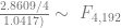


The critical value for 90% significance at 4 and 192 degrees of freedom would be 1.974 according to Texas A&M’s F calculator. That means we don’t have enough evidence that the parameters are different to treat them differently. This is probably an artifact of the small amount of data we have.
In the previous post, I looked at the trend in home runs per game in the Major Leagues and suggested that the recent deviation from the increasing trend might have been due to the development of strong farm systems like the Tampa Bay Rays’. That means that if the same data analysis process is used on data in an otherwise identical league, we should see similar trends but no dropoff around 1995. As usual, for replication purposes I’m going to use Japan’s Pro Baseball leagues, the Pacific and Central Leagues. They’re ideal because, just like the American Major Leagues, one league uses the designated hitter and one does not. There are some differences – the talent pool is a bit smaller because of the lower population base that the leagues draw from, and there are only 6 teams in each league as opposed to MLB’s 14 and 16.
As a reminder, the MLB regression gave us a regression equation of

where 
Just examining the data on home runs per game from the Japanese leagues, the trend looks significantly different. Instead of the rough U-shape that the MLB data showed, the Japanese data looks almost M-shaped with a maximum around 1984. (Why, I’m not sure – I’m not knowledgeable enough about Japanese baseball to know what might have caused that spike.) It reaches a minimum again and then keeps rising.
After running the same regression with t=1 in 1950, I got these results:
| Estimate | Std. Error | t-value | p-value | Signif | |
| B0 | 0.2462 | 0.0992 | 2.481 | 0.0148 | 0.9852 |
| t | 0.0478 | 0.0062 | 7.64 | 1.63E-11 | 1 |
| tsq | -0.0006 | 0.00009 | -7.463 | 3.82E-11 | 1 |
| DH | 0.0052 | 0.0359 | 0.144 | 0.8855 | 0.1145 |
This equation shows two things, one that surprises me and one that doesn’t. The unsurprising factor is the switching of signs for the t variables – we expected that based on the shape of the data. The surprising factor is that the designated hitter rule is insignificant. We can only be about 11% sure it’s significant. In addition, this model explains less of the variation than the MLB version – while that explained about 56% of the variation, the Japanese model has an 
There’s a slightly interesting pattern to the residual home runs per game ( it isn’t as pronounced, this data also shows a spike – but the spike is at t=55, so instead of showing up in 1995, the Japan leagues spiked around the early 2000s. Clearly the same effect is not in play, but why might the Japanese leagues see the same effect later than the MLB teams? It can’t be an expansion effect, since the Japanese leagues have stayed constant at 6 teams since their inception.
Incidentally, the Japanese league data is heteroskedastic (Breusch-Pagan test p-value .0796), so it might be better modeled using a generalized least squares formula, but doing so would have skewed the results of the replication.
In order to show that the parameters really are different, the appropriate test is Chow’s test for structural change. To clean it up, I’m using only the data from 1960 on. (It’s quick and dirty, but it’ll do the job.) Chow’s test takes
)/(k)}{(S_1+S_2)/(N_1+N_2-2k)} ~ F")
Back when it was hard to hit 55… July 8, 2010
Posted by tomflesher in Baseball, Economics.Tags: Baseball, baseball-reference.com, home runs, R, regression, sabermetrics, Stuff Keith Hernandez Says, talent pool dilution, Willie Mays, Year of the Pitcher
add a comment
Last night was one of those classic Keith Hernandez moments where he started talking and then stopped abruptly, which I always like to assume is because the guys in the truck are telling him to shut the hell up. He was talking about Willie Mays for some reason, and said that Mays hit 55 home runs “back when it was hard to hit 55.” Keith coyly said that, while it was easy for a while, it was “getting hard again,” at which point he abruptly stopped talking.
Keith’s unusual candor about drug use and Mays’ career best of 52 home runs aside, this pinged my “Stuff Keith Hernandez Says” meter. After accounting for any time trend and other factors that might explain home run hitting, is there an upward trend? If so, is there a pattern to the remaining home runs?
The first step is to examine the data to see if there appears to be any trend. Just looking at it, there appears to be a messy U shape with a minimum around t=20, which indicates a quadratic trend. That means I want to include a term for time and a term for time squared.
Using the per-game averages for home runs from 1955 to 2009, I detrended the data using t=1 in 1955. I also had to correct for the effect of the designated hitter. That gives us an equation of the form

The results:
| Estimate | Std. Error | t-value | p-value | Signif | |
| B0 | 0.957 | 0.0328 | 29.189 | 0.0001 | 0.9999 |
| t | -0.0188 | 0.0028 | -6.738 | 0.0001 | 0.9999 |
| tsq | 0.0004 | 0.00005 | 8.599 | 0.0001 | 0.9999 |
| DH | 0.0911 | 0.0246 | 3.706 | 0.0003 | 0.9997 |
We can see that there’s an upward quadratic trend in predicted home runs that together with the DH rule account for about 56% of the variation in the number of home runs per game in a season (
Then, I needed to look at the difference between the predicted number of home runs per game and the actual number of home runs per game, which is accessible by subtracting

This represents the “abnormal” number of home runs per year. The question then becomes, “Is there a patt ern to the number of abnormal home runs?” There are two ways to answer this. The first way is to look at the abnormal home runs. Up until about t=40 (the mid-1990s), the abnormal home runs are pretty much scattershot above and below 0. However, at t=40, the residual jumps up for both leagues and then begins a downward trend. It’s not clear what the cause of this is, but the knee-jerk reaction is that there might be a drug use effect. On the other hand, there are a couple of other explanations.
The most obvious is a boring old expansion effect. In 1993, the National League added two teams (the Marlins and the Rockies), and in 1998 each league added a team (the AL’s Rays and the NL’s Diamondbacks). Talent pool dilution has shown up in our discussion of hit batsmen, and I believe that it can be a real effect. It would be mitigated over time, however, by the establishment and development of farm systems, in particular strong systems like the one that’s producing good, cheap talent for the Rays.
How often should Youk take his base? June 30, 2010
Posted by tomflesher in Baseball, Economics.Tags: Baseball, baseball-reference.com, binomial distribution, Brett Carroll, Greek God of Take Your Base, hit batsmen, hit by pitch, Kevin Youkilis, R
add a comment
Kevin Youkilis is sometimes called “The Greek God of Walks.” I prefer to think of him as “The Greek God of Take Your Base,” since he seems to get hit by pitches at an alarming rate. In fact, this year, he’s been hit 7 times in 313 plate appearances. (Rickie Weeks, however, is leading the pack with 13 in 362 plate appearances. We’ll look at him, too.) There are three explanations for this:
- There’s something about Youk’s batting or his hitting stance that causes him to be hit. This is my preferred explanation. Youkilis has an unusual batting grip that thrusts his lead elbow over the plate, and as he swings, he lunges forward, which exposes him to being plunked more often.
- Youkilis is such a hitting machine that the gets hit often in order to keep him from swinging for the fences. This doesn’t hold water, to me. A pitcher could just as easily put him on base safely with an intentional walk, so unless there’s some other incentive to hit him, there’s no reason to risk ejection by throwing at Youkilis. This leads directly to…
- Youk is a jerk. This is pretty self-explanatory, and is probably a factor.
First of all, we need to figure out whether it’s likely that Kevin is being hit by chance. To figure that out, we need to make some assumptions about hit batsmen and evaluate them using the binomial distribution. I’m also excited to point out that Youk has been overtaken as the Greek God of Take Your Base by someone new: Brett Carroll. (more…)
What is the effect of the Designated Hitter? May 30, 2010
Posted by tomflesher in Baseball.Tags: baseball-reference.com, designated hitter, R, regression
2 comments
Intuitively, the designated hitter rule seems like it should increase scoring. By getting on base more often than the pitcher would have, the designated hitter helps produce runs by hitting, by being on base so that other players can drive him in, and by not accumulating outs by bunting or striking out as often as the pitcher does. However, there should be a corresponding effect from having pitchers left in the game longer: a better pitcher who remains in the game might get more outs than a reliever who came in simply because the manager pinch-hit for the starting pitcher because he needed offense.
Behind the cut, I’ll explain the testing I did to determine whether the effect of a DH is positive (hint: it is) and look at how big an effect is actually there.
Cy Young gives me a headache. January 15, 2010
Posted by tomflesher in Baseball, Economics.Tags: Baseball, baseball-reference.com, Bill James, Cy Young predictor, economics, Eric Gagne, linear regression, R, Rob Neyer, sabermetrics, Tim Lincecum, Weighted saves, Weighted shutouts
add a comment
As usual, I’ve started my yearly struggle against a Cy Young predictor. Bill James and Rob Neyer’s predictor (which I’ve preserved for posterity here) did a pretty poor job this year, having predicted the wrong winner in both leagues and even getting the order very wrong compared to the actual results. Inside, I’d like to share some of my pain, since I can’t seem to do much better.
