What does a long game do to teams? April 13, 2015
Posted by tomflesher in Baseball.Tags: extra innings, file drawer, linear model, linear regression, Red Sox, Yankees
add a comment
Friday, the Red Sox took a 19-inning contest from the Yankees. Both teams have the unfortunate circumstance of finishing a game around 2:15 A.M. and having to be back on the field at 1:05 PM. Everyone, including the announcers, discussed how tired the teams would be; in particular, first baseman Mark Teixeira spent a long night on the bag to keep backup first baseman and apparent emergency pitcher Garrett Jones fresh, leading Alex Rodriguez to make his first career appearance at first base on Saturday.
Teixeira wasn’t the only player to sit out the next day – center fielders Jacoby Ellsbury and Mookie Betts, catchers Brian McCann and Sandy Leon, and most of the bullpen all sat out, among others. The Yankees called up pitcher Matt Tracy for a cup of coffee and sent Chasen Shreve down, then swapped Tracy back down to Scranton for Kyle Davies. Boston activated starter Joe Kelly from the disabled list, sending winning pitcher Steven Wright down to make room. Shreve and Wright each had solid outings, with Wright pitching five innings with 2 runs and Shreve pitching 3 1/3 scoreless.
All those moves provide some explanation for a surprising result. Interested in what the effect of these long games are, I dug up all of the games from 2014 that lasted 14 innings or more. In a quick and dirty data set, I traced the scores for each team in their next games along with the number of outs pitched and the length in minutes of the game.
I fitted two linear models and two log models: two each with the next game’s runs as the dependent variable and two each with the difference in runs (next game’s runs – long game’s runs) as the dependent variable. Each used the length of the game in minutes, the number of outs, the average runs scored by the team during 2014, and an indicator variable for the presence of a designated hitter in each game. For each dependent variable, I modeled all variables in a linear form once and the natural log of outs and the natural log of the length of the game once.
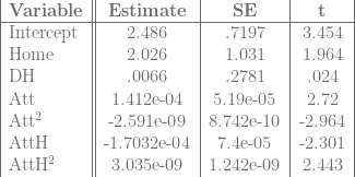
With runs scored as the dependent variable, nothing was significant. That is, no variable correlated strongly with an increase or decrease in the number of runs scored.
With a run difference model, the length of the game in minutes became marginally significant. For the linear model, extending the length of the game by one minute lowers the difference in runs by about .043 runs – that is, normalizing for the number of runs scored the previous day, extending the game by one minute lowered the runs the next day by about .043. In the semilog model, extending the game by about 1% lowered the run difference by about 14; this was offset by an extremely high intercept term. This is a very high semielasticity, and both coefficients had p-values between .01 and .015. Nothing else was even close.
With all of the usual caveats about statistical analysis, this shows that teams are actually pretty good at bouncing back from long games, either due to the fact that most of the time they’re playing the same team (so teams are equally fatigued) or due to smart roster moves. Either way, it’s a surprise.
Home Runs Per Game: A bit more in-depth December 23, 2011
Posted by tomflesher in Baseball, Economics.Tags: AR, autoregression, baseball-reference.com, home runs, home runs per plate appearance, linear regression, talent pool dilution
add a comment
I know I’ve done this one before, but in my defense, it was a really bad model.
I made some odd choices in modeling run production in that post. The first big questionable choice was to detrend according to raw time. That might make sense starting with a brand-new league, where we’d expect players to be of low quality and asymptotically approach a true level of production – a quadratic trend would be an acceptable model of dynamics in that case. That’s not a sensible way to model the major leagues, though; even though there’s a case to be made that players being in better physical condition will lead to better production, there’s no theoretical reason to believe that home run production will grow year over year.
So, let’s cut to the chase: I’m trying to capture a few different effects, and so I want to start by running a linear regression of home runs on a couple of controlling factors. Things I want to capture in the model:
- The DH. This should have a positive effect on home runs per game.
- Talent pool dilution. There are competing effects – more batters should mean that the best batters are getting fewer plate appearances, as a percentage of the total, but at the same time, more pitchers should mean that the best pitchers are facing fewer batters as a percentage of the total. I’m including three variables: one for the number of batters and one for the number of pitchers, to capture those effects individually, and one for the number of teams in the league. (All those variables are in natural logarithm form, so the interpretation will be that a 1% change in the number of batters, pitchers, or teams will have an effect on home runs.) The batting effect should be negative (more batters lead to fewer home runs); the pitching effect should be positive (more pitchers mean worse pitchers, leading to more home runs); the team effect could go either way, depending on the relative strengths of the effects.
- Trends in strategy and technology. I can’t theoretically justify a pure time trend, but I also can’t leave out trends entirely. Training has improved. Different training regimens become popular or fade away, and some strategies are much different than in previous years. I’ll use an autoregressive process to model these.
My dependent variable is going to be home runs per plate appearance. I chose HR/PA for two reasons:
- I’m using Baseball Reference’s AL and NL Batting Encyclopedias, which give per-game averages; HR per game/PA per game will wash out the per-game adjustments.
- League HR/PA should show talent pool dilution as noted above – the best hitters get the same plate appearances but their plate appearances will make up a smaller proportion of the total. I’m using the period from 1955 to 2010.
After dividing home runs per game by plate appearances per game, I used R to estimate an autoregressive model of home runs per plate appearance. That measures whether a year with lots of home runs is followed by a year with lots of home runs, whether it’s the reverse, or whether there’s no real connection between two consecutive years. My model took the last three years into account:

Since the model doesn’t fit perfectly, there will be an “error” term, 

The results:

The DH and batter effects aren’t statistically different from zero, surprisingly; the pitching effect and the team effect are both significant at the 95% level. Interestingly, the team effect and the pitching effect have opposite signs, meaning that there’s some factor in increasing the number of teams that doesn’t relate purely to pitching or batting talent pool dilution.
For the record, fitted values of innovations correlate fairly highly with HR/PA: the correlation is about .70, despite a pretty pathetic R-squared of .08.
Home Field Advantage Again July 12, 2011
Posted by tomflesher in Baseball, Economics.Tags: attendance effects, Baseball, Giants, home field advantage, linear regression, probability, probit, statistics
add a comment
In an earlier post, I discussed the San Francisco Giants’ vaunted home field advantage and came to the conclusion that, while a home field advantage exists, it’s not related to the Giants scoring more runs at home than on the road. That was done with about 90 games’ worth of data. In order to come up with a more robust measure of home field advantage, I grabbed game-by-game data for the national league from the first half of the 2011 season and crunched some numbers.
I have two questions:
- Is there a statistically significant increase in winning probability while playing at home?
- Is that effect statistically distinct from any effect due to attendance?
- If it exists, does that effect differ from team to team? (I’ll attack this in a future post.)
Methodology: Using data with, among other things, per-game run totals, win-loss data, and attendance, I’ll run three regressions. The first will be a linear probability model of the form

where 

As such, I’ll also run a Probit model of the same equation to avoid problems caused by the simplicity of the linear probability model.
Finally, just as a sanity check, I’ll run the same regression, but for runs, instead of win probability. Since runs aren’t binary, I’ll use ordinary least squares, and also control for the possibility that games played in American League parks lead to higher run totals by controlling for the designated hitter:

Since runs are a factor in winning, I have the same expectations about the signs of the beta values as above.
Results:
Regression 1 (Linear Probability Model):

So, my prediction about the attendance betas was incorrect, but only because I failed to account for the squared terms. The effect from home attendance increases as we approach full attendance; the effect from road attendance decreases at about the same rate. There’s still a net positive effect.
Regression 2 (Probit Model):

Note that in both cases, there’s a statistically significant 
Finally, the regression on runs:
Regression 3 (Predicted Runs):
Again, with runs, there is a statistically significant effect from being at home, and a variety of possible attendance effects. For low attendance values, the Home effect is probably swamped by the negative attendance effect, but for high attendance games, the Home effect probably outweighs the attendance effect or the attendance effect becomes positive.
Again, the Home effect is statistically significant no matter which model we use, so at least in the National League, there is a noticeable home field advantage.
Padre Differential July 11, 2011
Posted by tomflesher in Baseball, Economics.Tags: Baseball, baseball-reference.com, linear regression, National League, Padre Differential, Padres, Phillies, runs allowed, runs scored, statistics
1 comment so far
I was all set to fire up the Choke Index again this year. Unfortunately, Derek Jeter foiled my plan by making his 3000th hit right on time, so I can’t get any mileage out of that. Perhaps Jim Thome will start choking around #600 – but, frankly, I hope not. Since Jeter had such a callous disregard for the World’s Worst Sports Blog’s material, I’m forced to make up a new statistic.
This actually plays into an earlier post I made, which was about home field advantage for the Giants. It started off as a very simple regression for National League teams to see if the Giants’ pattern – a negative effect on runs scored at home, no real effect from the DH – held across the league. Those results are interesting and hold with the pattern that we’ll see below – I’ll probably slice them into a later entry.
The first thing I wanted to do, though, was find team effects on runs scored. Basically, I want to know how many runs an average team of Greys will score, how many more runs they’ll score at home, how many more runs they’ll score on the road if they have a DH, and then how many more runs the Phillies, the Mets, or any other team will score above their total. I’m doing this by converting Baseball Reference’s schedules and results for each team through their last game on July 10 to a data file, adding dummy variables for each team, and then running a linear regression of runs scored by each team against dummy variables for playing at home, playing with a DH, and the team dummies. In equation form,

For technical reasons, I needed to leave a team out, and so I chose the team that had the most negative coefficient: the Padres. Basically, then, the 

That is, the Padre Differential shows whether a team’s per-game run differential is higher or lower than the Padres’.
The table below shows each team in the National League, sorted by Padre Differential. By definition, San Diego’s Padre Differential is zero. ‘Sig95’ represents whether or not the value is statistically significant at the 95% level.

Unsurprisingly, the Phillies – the best team in baseball – have the highest Padre Differential in the league, with over 1.3 runs on average better than the Padres. Houston, in the cellar of the NL Central, is the worst team in the league and is .8 runs worse than the Padres per game. Florida and Chicago are both worse than the Padres and are both close to (Florida, 43) or below (Chicago, 37) the Padres’ 40-win total.
Home Field Advantage July 9, 2011
Posted by tomflesher in Baseball, Economics.Tags: Giants, home field advantage, linear regression
1 comment so far
The Mets unfortunately played a 10 PM game in San Francisco last night, so I’m short on sleep today. I do remember, though, that Gary Cohen mentioned, repeatedly, the Giants’ significant home field advantage. Even after last night’s loss at the hands of Carlos Beltran (coming from a rare blown save by Brian Wilson), the Giants have a .619 winning percentage at home (26-16) versus a .500 winning percentage on the road (24-24). Interestingly, their run differential is much worse at home – they’ve scored 205 and allowed 184 on the road for a total differential of +21, but their run differential at home is actually negative. They’ve scored 120 but allowed 135 for a differential of -15.
Some of that is due to the way walk-offs are scored – they end an inning immediately, so a scoring inning at home is cut short when the same inning on the road would continue and might lead to further scoring – but it’s still quite shocking to see that large a split. So far, the Giants have only scored 11 walk-off RBIs, compared with only 7 RBIs in the 9th inning on the road that came with the Giants ahead. So, even adding in an extra few runs wouldn’t account for the difference.
Last year, there wasn’t much of a home field effect at all. Running a very simple linear regression of runs scored against dummy variables for playing at home and playing with a DH, I estimated that

and only the intercept term, which represents (essentially) the unconditional average number of runs the Giants score, was significant.
For this year, the numbers are quite different.

with both the intercept and Home terms significant at the 95% level. It’s clear that the Giants are winning more at home, but it’s not because they’re scoring more at home.
Is scoring different in the AL and the NL? May 31, 2011
Posted by tomflesher in Baseball, Economics.Tags: American League, Baseball, baseball-reference.com, bunts, Chow test, linear regression, National League, R, structural break
1 comment so far
The American League and the National League have one important difference. Specifically, the AL allows the use of a player known as the Designated Hitter, who does not play a position in the field, hits every time the pitcher would bat, and cannot be moved to a defensive position without forfeiting the right to use the DH. As a result, there are a couple of notable differences between the AL and the NL – in theory, there should be slightly more home runs and slightly fewer sacrifice bunts in the AL, since pitchers have to bat in the NL and they tend to be pretty poor hitters. How much can we quantify that difference? To answer that question, I decided to sample a ten-year period (2000 until 2009) from each league and run a linear regression of the form

Where runs are presumed to be a function of hits, doubles, triples, home runs, stolen bases, times caught stealing, walks, strikeouts, hit batsmen, bunts, and sacrifice flies. My expectations are:
- The sacrifice bunt coefficient should be smaller in the NL than in the AL – in the American League, bunting is used strategically, whereas NL teams are more likely to bunt whenever a pitcher appears, so in any randomly-chosen string of plate appearances, the chance that a bunt is the optimal strategy given an average hitter is much lower. (That is, pitchers bunt a lot, even when a normal hitter would swing away.) A smaller coefficient means each bunt produces fewer runs, on average.
- The strategy from league to league should be different, as measured by different coefficients for different factors from league to league. That is, the designated hitter rule causes different strategies to be used. I’ll use a technique called the Chow test to test that. That means I’ll run the linear model on all of MLB, then separately on the AL and the NL, and look at the size of the errors generated.
The results:
- In the AL, a sac bunt produces about .43 runs, on average, and that number is significant at the 95% level. In the NL, a bunt produces about .02 runs, and the number is not significantly different from saying that a bunt has no effect on run production.
- The Chow Test tells us at about a 90% confidence level that the process of producing runs in the AL is different than the process of producing runs in the NL. That is, in Major League Baseball, the designated hitter has a statistically significant effect on strategy. There’s structural break.
R code is behind the cut.
Cy Young gives me a headache. January 15, 2010
Posted by tomflesher in Baseball, Economics.Tags: Baseball, baseball-reference.com, Bill James, Cy Young predictor, economics, Eric Gagne, linear regression, R, Rob Neyer, sabermetrics, Tim Lincecum, Weighted saves, Weighted shutouts
add a comment
As usual, I’ve started my yearly struggle against a Cy Young predictor. Bill James and Rob Neyer’s predictor (which I’ve preserved for posterity here) did a pretty poor job this year, having predicted the wrong winner in both leagues and even getting the order very wrong compared to the actual results. Inside, I’d like to share some of my pain, since I can’t seem to do much better.
