Adventures in the Mets Bullpen: One-Run No-Decisions and Vulture Wins July 19, 2010
Posted by tomflesher in Baseball.Tags: Francisco Rodriguez, Jason Stark, Johan Santana, Mets, one-run no-decisions, Phil Cuzzi, Phil Cuzzi's hissyfit, Randy Wels, Roy Halladay, Ted Lilly, Tyler Clippard, vulture wins, Yovani Gallardo
add a comment
A close cousin of the Tough Loss discussed earlier is what Jayson Stark of ESPN calls the Criminally Unsupported Start. Stark defines a CUS as a start in which the pitcher pitches 6 or more innings but the offense scores one run or less in support. Johan Santana didn’t fit that definition last night, but he was close: he left the game with a 2-1 lead after 8 innings pitched and ended up with a no-decision. (A friend of mine liked to call that “the ol’ Roy Halladay” back when Doc was pitching in Toronto.) Just as he was the centerpiece of Jayson Stark’s CUS standings back in 2007, Santana currently leads the league in starts with 6.0 or more innings pitched, at most one run allowed, and no decision. He has six such games, and no other pitcher has more than four. (Yovani Gallardo, however, has a respectable 3.)
In all of 2009, no one hit the six-game mark in one-run no-decisions. Surprisingly, this year the Mets aren’t leading the league in these one-run no-decisions – the Cubs are, led by Randy Wells and his impressive 4, along with Ted Lilly with 3.
Francisco Rodriguez also picked up his third Vulture Win of the year last night. A vulture win is the combination of a blown save and a win in the same game. Usually, that happens when a hometown closer blows the save in the top of the 9th and his teammates score in the bottom for the win. Frankie blew the save in the bottom of the 9th last night, but they left him in to pitch the bottom of the 10th and he held on (despite Phil Cuzzi’s hissyfit and some questionable umpiring going in both directions). Tyler Clippard leads the league in vulture wins this year with four.
The Kate Smith Effect July 18, 2010
Posted by tomflesher in Baseball.Tags: binomial distribution, Flyers, hockey-reference.com, Kate Smith, Kate Smith Effect
add a comment
From the Mountains…
To the Prairies…
To the Oceans…
White with foam….
It’s “well-known” that when Kate Smith sings “God Bless America” – whether live starting in 1969 or on videotape now – the Philadelphia Flyers play better, or at least they’re more likely to win. As Wikipedia indicates, she’s considered a good luck charm for the Flyers. How much does she help?
Since 1969, the Flyers have played in 3268 games and won 1631 of them for an observed win percentage of .4991. That’s very close to the long-term win percentage of .50 that we’d expect for any team. Of those games, Kate Smith sang or was played at 114 of them with a total record of 87-23-4, and the record when Kate Smith did not sing was 1544 wins in 3154 games for a “non-Kate” win proportion of .4895. I’ll make the null hypothesis that the Flyers play exactly the same way in games where “God Bless America” is sung – “Kate games” – as they do when it isn’t. That means that

The simplest way to attack this is to note that the Flyers’ win percentage in Kate games is .7632. Qualitatively, that’s quite a jump – surely, it must be significant. Of course, we can’t leave it at that.
First, note that with an observed proportion of .4895, the binomial probability of winning 87 games in 114 trials is approximately .00000000145 – that’s about 145 in one hundred billion. That’s highly unlikely. However, other methods can help us quantify the Kate Smith Effect.
The standard error for proportions is

With 113 degrees of freedom and a 95% confidence interval, I used Texas A&M’s t Calculator to find that the appropriate critical value is 1.98. That means that we can be 95% confident that the win percentage in Kate games after controlling for other factors is somewhere in the range


Since the true proportion in non-Kate games is .4895, that means the Kate Smith Effect is somewhere in the range

Though I can’t explain why, it’s apparent that there’s a Kate Smith Effect of at least 20% in terms of winning percentage. This isn’t to say that playing Kate Smith’s “God Bless America” causes good luck. Since the Kate video is considered a good luck charm, it’s probably more likely that the players play harder in games that are deemed important enough to play it.
Cheap Wins July 16, 2010
Posted by tomflesher in Baseball.Tags: baseball-reference.com, Bill James, Brian Bannister, Cheap Wins, Joe Saunders, John Danks, John Lackey, R.A. Dickey, Ricky Romero, Roy Halladay, Tim Lincecum, Tim Wakefield, Tough Losses, Yovani Gallardo
4 comments
The opposite of the Tough Loss discussed below (which R.A. Dickey unfortunately experienced tonight in a duel with Tim Lincecum) is a Cheap Win. Logically, since a Tough Loss is a loss in a quality start, a Cheap Win (invented by Bill James) is a win in a non-quality start – that is, a start with a game score of below 50 (or, officially, a start with fewer than 6.0 innings pitched or more than 3 runs allowed).
The Chicago White Sox’ starter, John Danks, picked up a Cheap Win in Thursday’s game against the Twins. Although he pitched six innings, he gave up six runs (all earned) in the second inning, leading to an abysmal game score of 33. Danks had two of last year’s 304 Cheap Wins. Ricky Romero led the pack with six, and Joe Saunders and Tim Wakefield were both among the six pitchers with five Cheap Wins. Even Roy Halladay had two.
Through the beginning of the All-Star Break, there have been 136 Cheap Wins in 2010. That includes one by my current favorite player, Yovani Gallardo. John Lackey is already up to 5, and Brian Bannister is knocking on the door with 4.
It’s hard to read too much into the tea leaves of Cheap Wins, since they’re not all created equal. In general, they represent a pitcher sliding a little bit off his game, but his team upping their run production to rescue him. To that end, Cheap Wins might be a better measure of a team’s ability than Tough Losses, since, while Tough Losses show a pitcher maintaining himself under fire, Cheap Wins represent an ability to hit in the clutch (assuming that run production in Cheap Wins is significantly different from run production in other games). That’s hard to validate without doing a bit more work, but it’s a project to consider.
Paul the Octopus: Credible? July 11, 2010
Posted by tomflesher in Economics.Tags: binomial distribution, Paul the Octopus, statistics, World Cup
add a comment
Paul the Octopus (hatched 2008) is an octopus who correctly predicted 12 of 14 World Cup matches, including

Spain’s victory over the Dutch. Is his string of victories statistically significant?
First, I’m going to posit the null hypothesis that Paul is choosing randomly. As such, Paul’s proportion of correct choices should be .5 (
The standard error for proportions is

The t-value of an observation is

According to Texas A&M’s t Distribution Calculator, the probability (or p-value) of this result by chance alone is less than .01.
Using the binomial distribution with 
So, is Paul an oracle? Almost certainly not. However, not being a zoologist, I can’t explain what biases might be in play. I’d imagine it’s something like an attraction to contrast as well as a spurious correlation between octopus-attractive flags and success at soccer.
More on Home Runs Per Game July 9, 2010
Posted by tomflesher in Baseball, Economics.Tags: Baseball, baseball-reference.com, Chow test, home runs, Japan, Japanese baseball, R, Rays, regression, replication
add a comment
In the previous post, I looked at the trend in home runs per game in the Major Leagues and suggested that the recent deviation from the increasing trend might have been due to the development of strong farm systems like the Tampa Bay Rays’. That means that if the same data analysis process is used on data in an otherwise identical league, we should see similar trends but no dropoff around 1995. As usual, for replication purposes I’m going to use Japan’s Pro Baseball leagues, the Pacific and Central Leagues. They’re ideal because, just like the American Major Leagues, one league uses the designated hitter and one does not. There are some differences – the talent pool is a bit smaller because of the lower population base that the leagues draw from, and there are only 6 teams in each league as opposed to MLB’s 14 and 16.
As a reminder, the MLB regression gave us a regression equation of

where 
Just examining the data on home runs per game from the Japanese leagues, the trend looks significantly differe nt. Instead of the rough U-shape that the MLB data showed, the Japanese data looks almost M-shaped with a maximum around 1984. (Why, I’m not sure – I’m not knowledgeable enough about Japanese baseball to know what might have caused that spike.) It reaches a minimum again and then keeps rising.
After running the same regression with t=1 in 1950, I got these results:
| Estimate | Std. Error | t-value | p-value | Signif | |
| B0 | 0.2462 | 0.0992 | 2.481 | 0.0148 | 0.9852 |
| t | 0.0478 | 0.0062 | 7.64 | 1.63E-11 | 1 |
| tsq | -0.0006 | 0.00009 | -7.463 | 3.82E-11 | 1 |
| DH | 0.0052 | 0.0359 | 0.144 | 0.8855 | 0.1145 |
This equation shows two things, one that surprises me and one that doesn’t. The unsurprising factor is the switching of signs for the t variables – we expected that based on the shape of the data. The surprising factor is that the designated hitter rule is insignificant. We can only be about 11% sure it’s significant. In addition, this model explains less of the variation than the MLB version – while that explained about 56% of the variation, the Japanese model has an 
There’s a slightly interesting pattern to the residual home runs per game (
 it isn’t as pronounced, this data also shows a spike – but the spike is at t=55, so instead of showing up in 1995, the Japan leagues spiked around the early 2000s. Clearly the same effect is not in play, but why might the Japanese leagues see the same effect later than the MLB teams? It can’t be an expansion effect, since the Japanese leagues have stayed constant at 6 teams since their inception.
Incidentally, the Japanese league data is heteroskedastic (Breusch-Pagan test p-value .0796), so it might be better modeled using a generalized least squares formula, but doing so would have skewed the results of the replication.
In order to show that the parameters really are different, the appropriate test is Chow’s test for structural change. To clean it up, I’m using only the data from 1960 on. (It’s quick and dirty, but it’ll do the job.) Chow’s test takes

where 


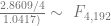


The critical value for 90% significance at 4 and 192 degrees of freedom would be 1.974 according to Texas A&M’s F calculator. That means we don’t have enough evidence that the parameters are different to treat them differently. This is probably an artifact of the small amount of data we have.
In the previous post, I looked at the trend in home runs per game in the Major Leagues and suggested that the recent deviation from the increasing trend might have been due to the development of strong farm systems like the Tampa Bay Rays’. That means that if the same data analysis process is used on data in an otherwise identical league, we should see similar trends but no dropoff around 1995. As usual, for replication purposes I’m going to use Japan’s Pro Baseball leagues, the Pacific and Central Leagues. They’re ideal because, just like the American Major Leagues, one league uses the designated hitter and one does not. There are some differences – the talent pool is a bit smaller because of the lower population base that the leagues draw from, and there are only 6 teams in each league as opposed to MLB’s 14 and 16.
As a reminder, the MLB regression gave us a regression equation of

where 
Just examining the data on home runs per game from the Japanese leagues, the trend looks significantly different. Instead of the rough U-shape that the MLB data showed, the Japanese data looks almost M-shaped with a maximum around 1984. (Why, I’m not sure – I’m not knowledgeable enough about Japanese baseball to know what might have caused that spike.) It reaches a minimum again and then keeps rising.
After running the same regression with t=1 in 1950, I got these results:
| Estimate | Std. Error | t-value | p-value | Signif | |
| B0 | 0.2462 | 0.0992 | 2.481 | 0.0148 | 0.9852 |
| t | 0.0478 | 0.0062 | 7.64 | 1.63E-11 | 1 |
| tsq | -0.0006 | 0.00009 | -7.463 | 3.82E-11 | 1 |
| DH | 0.0052 | 0.0359 | 0.144 | 0.8855 | 0.1145 |
This equation shows two things, one that surprises me and one that doesn’t. The unsurprising factor is the switching of signs for the t variables – we expected that based on the shape of the data. The surprising factor is that the designated hitter rule is insignificant. We can only be about 11% sure it’s significant. In addition, this model explains less of the variation than the MLB version – while that explained about 56% of the variation, the Japanese model has an 
There’s a slightly interesting pattern to the residual home runs per game ( it isn’t as pronounced, this data also shows a spike – but the spike is at t=55, so instead of showing up in 1995, the Japan leagues spiked around the early 2000s. Clearly the same effect is not in play, but why might the Japanese leagues see the same effect later than the MLB teams? It can’t be an expansion effect, since the Japanese leagues have stayed constant at 6 teams since their inception.
Incidentally, the Japanese league data is heteroskedastic (Breusch-Pagan test p-value .0796), so it might be better modeled using a generalized least squares formula, but doing so would have skewed the results of the replication.
In order to show that the parameters really are different, the appropriate test is Chow’s test for structural change. To clean it up, I’m using only the data from 1960 on. (It’s quick and dirty, but it’ll do the job.) Chow’s test takes
)/(k)}{(S_1+S_2)/(N_1+N_2-2k)} ~ F")
Back when it was hard to hit 55… July 8, 2010
Posted by tomflesher in Baseball, Economics.Tags: Baseball, baseball-reference.com, home runs, R, regression, sabermetrics, Stuff Keith Hernandez Says, talent pool dilution, Willie Mays, Year of the Pitcher
add a comment
Last night was one of those classic Keith Hernandez moments where he started talking and then stopped abruptly, which I always like to assume is because the guys in the truck are telling him to shut the hell up. He was talking about Willie Mays for some reason, and said that Mays hit 55 home runs “back when it was hard to hit 55.” Keith coyly said that, while it was easy for a while, it was “getting hard again,” at which point he abruptly stopped talking.
Keith’s unusual candor about drug use and Mays’ career best of 52 home runs aside, this pinged my “Stuff Keith Hernandez Says” meter. After accounting for any time trend and other factors that might explain home run hitting, is there an upward trend? If so, is there a pattern to the remaining home runs?
The first step is to examine the data to see if there appears to be any trend. Just looking at it, there appears to be a messy U shape with a minimum around t=20, which indicates a quadratic trend. That means I want to include a term for time and a term for time squared.
Using the per-game averages for home runs from 1955 to 2009, I detrended the data using t=1 in 1955. I also had to correct for the effect of the designated hitter. That gives us an equation of the form

The results:
| Estimate | Std. Error | t-value | p-value | Signif | |
| B0 | 0.957 | 0.0328 | 29.189 | 0.0001 | 0.9999 |
| t | -0.0188 | 0.0028 | -6.738 | 0.0001 | 0.9999 |
| tsq | 0.0004 | 0.00005 | 8.599 | 0.0001 | 0.9999 |
| DH | 0.0911 | 0.0246 | 3.706 | 0.0003 | 0.9997 |
We can see that there’s an upward quadratic trend in predicted home runs that together with the DH rule account for about 56% of the variation in the number of home runs per game in a season (
Then, I needed to look at the difference between the predicted number of home runs per game and the actual number of home runs per game, which is accessible by subtracting

This represents the “abnormal” number of home runs per year. The question then becomes, “Is there a patt ern to the number of abnormal home runs?” There are two ways to answer this. The first way is to look at the abnormal home runs. Up until about t=40 (the mid-1990s), the abnormal home runs are pretty much scattershot above and below 0. However, at t=40, the residual jumps up for both leagues and then begins a downward trend. It’s not clear what the cause of this is, but the knee-jerk reaction is that there might be a drug use effect. On the other hand, there are a couple of other explanations.
The most obvious is a boring old expansion effect. In 1993, the National League added two teams (the Marlins and the Rockies), and in 1998 each league added a team (the AL’s Rays and the NL’s Diamondbacks). Talent pool dilution has shown up in our discussion of hit batsmen, and I believe that it can be a real effect. It would be mitigated over time, however, by the establishment and development of farm systems, in particular strong systems like the one that’s producing good, cheap talent for the Rays.
Tough Losses July 8, 2010
Posted by tomflesher in Baseball.Tags: Baseball, baseball-reference.com, Dan Haren, Jon Niese, Roy Halladay, Roy Oswalt, Ubaldo Jimenez, weird lines, Year of the Pitcher, Yovani Gallardo
2 comments
Last night, Jonathon Niese pitched 7.2 innings of respectable work (6 hits, 3 runs, all earned, 1 walk, 8 strikeouts, 2 home runs, for a game score of 62) but still took the loss due to his unfortunate lack of run support – the Mets’ only run came in from an Angel Pagan solo homer. This is a prime example of what Bill James called a “Tough Loss”: a game in which the starting pitcher made a quality start but took a loss anyway.
There are two accepted measures of what a quality start is. Officially, a quality start is one with 6 or more innings pitched and 3 or fewer runs. Bill James’ definition used his game score statistic and used 50 as the cutoff point for a quality start. Since a pitcher gets 50 points for walking out on the mound and then adds to or subtracts from that value based on his performance, game score has the nice property of showing whether a pitcher added value to the team or not.
Using the game score definition, there were 393 losses in quality starts last year, including 109 by July 7th. Ubaldo Jimenez and Dan Haren led the league with 7, Roy Halladay had 6, and Yovani Gallardo (who’s quickly becoming my favorite player because he seems to show up in every category) was also up there with 6.
So far this year, though, it seems to be the Year of the Tough Loss. There have already been 230, and Roy Oswalt is already at the 6-tough-loss mark. Halladay is already up at 4. This is consistent with the talk of the Year of the Pitcher, with better pitching (and potentially less use of performance-enhancing drugs) leading to lower run support. That will require a bit more work to confirm, though.
Santana the Late-Blooming Hitter July 7, 2010
Posted by tomflesher in Baseball.Tags: Brewers, Dave Eiland, home runs, Jason Jennings, Johan Santana, Mets, Pitchers batting, Yovani Gallardo
add a comment
Last night, Johan Santana hit his first home run in his 87th career game as a batter. (Granted, he’s played far more than that many games because he played a few years in the American League.) Out of curiosity, I checked Baseball-Reference.com’s Play Index to see how many home runs have been hit by pitchers in their first 87 games as batters.
Since 1961, there have been 431 home runs (although the Play Index only lists games starting at 1970, so that may or may not be accurate). Four pitchers have hit home runs in their first games, including Yankee pitching coach Dave Eiland in 1992 and Rockies pitcher Jason Jennings. Like Johan, Jennings pitched a complete game shutout for the win that night.
The all-time leader in home runs by a pitcher in the first 87 games (how’s that for esoteric?) is Yovani Gallardo, who’s in his fourth season pitching for the Brewers. He’s hit seven of them, and as of July 4 he’s only hit in 71 games. He’s got a lot of time to pick up the pace and possibly hit the triple-digit mark when he gets back from the disabled list some time after July 20.
Pinch Hitters from the Bullpen July 6, 2010
Posted by tomflesher in Baseball, Economics.Tags: binomial distribution, bullpen, Carlos Zambrano, Livan Hernandez, margin of error, Micah Owings, pinch hitter, sabermetrics
add a comment
Occasionally, a solid two-way player shows up in the majors. Carlos Zambrano is known as a solid hitter with a great arm (despite the occasional meltdown), and Micah Owings is the rare pitcher used as a pinch hitter. Even Livan Hernandez has 15 pinch-hit plate appearances (with 2 sacrifice bunts, 6 strikeouts, and a .077 average and .077 OBP, compared with a lifetime .227 average and .237 OBP).
Like Hernandez, Zambrano has a very different batting line as a pinch hitter than as a pitcher. In 24 plate appearances as a pinch hitter, Big Z is hitting only .087 with a .087 OBP, compared to his .243/.249 line when hitting as a pitcher. Since we see the same effect for both of these pitchers, it seems like there’s some sort of difference in hitting as a pinch hitter that causes the pitchers to be less mentally prepared. Of course, these numbers come from a very small sample.
On the other hand, Micah Owings hits .307/.331 as a pitcher, and a quite similar .250/.298 as a pinch hitter. What’s the difference? Owings has almost double Zambrano’s plate appearances as a pinch hitter with 47. That seems to show that maybe Owings’ larger sample size is what causes the similarity. How can this be tested rigorously?
As we did with Kevin Youkilis and his title of Greek God of Take Your Base, we can use the binomial distribution to see if it’s reasonable for Owings, Hernandez and Zambrano to hit so differently as pinch hitters. To figure out whether it’s reasonable or not, let’s limit our inquiry to OBP just because it’s a more inclusive measure and then assume that the batting average as a pitcher (i.e. the one with a larger sample size) is the pitcher’s “true” batting average and use that to represent the probability of getting on base. Each plate appearance is a Bernoulli trial with a binary outcome – we’ll call it a success if the player gets on base and a failure otherwise.
Under the binomial distribution, the probability of a player with OBP p getting on base k times in n plate appearances is:

with

We’ll also need the margin of error for proportions. If p = OBP as pitcher, and we assume a t-distribution with over 100 plate appearances (i.e. degrees of freedom), then the margin of error is:

so that 95% of the time we’d expect the pinch hitting OBP to lie within

with
We’ll also need the margin of error for proportions. If p = OBP as pitcher, and we assume a t-distribution with over 100 plate appearances (i.e. degrees of freedom), then the margin of error is:
so that 95% of the time we’d expect the pinch hitting OBP to lie within
Let’s start with Owings. He has an OBP of .331 as a pitcher in 151 plate appearances, so the probability of having at most 14 times on base in 47 plate appearances is .3778. In other words, about 38% of the time, we’d expect a random string of 47 plate appearances to have 14 or fewer times on base. His 95% confidence interval is .254 to .408, so his .298 OBP as a pinch hitter is certainly statistically credible.
Owings is special, though. Hernandez, for example, has 994 plate appearances as a pitcher and a .237 OBP, with only one time on base in 15 plate appearances. It’s a very small sample, but the binomial distribution predicts he would have at most one time on base only about 9.8% of the time. His confidence interval is .210 to .264, which means that it’s very unlikely that he’d end up with an OBP of .077 unless there is some relevant difference between hitting as a pitcher and hitting as a pinch hitter.
Zambrano’s interval breaks down, too. He has 601 plate appearances as a pitcher with a .249 OBP, but an anemic .087 OBP (two hits) in 24 plate appearances as a pinch hitter. We’d expect 2 or fewer hits only 4% of the time, and 95% of the time we’d expect Big Z to hit between .214 and .284.
As a result, we can make two determinations.
- Zambrano and Hernandez are hitting considerably below expectations as pinch hitters. It’s likely, though not proven, that this is a pattern among most pitchers.
- Micah Owings is a statistical outlier from the pattern. It’s not clear why.
How often should Youk take his base? June 30, 2010
Posted by tomflesher in Baseball, Economics.Tags: Baseball, baseball-reference.com, binomial distribution, Brett Carroll, Greek God of Take Your Base, hit batsmen, hit by pitch, Kevin Youkilis, R
add a comment
Kevin Youkilis is sometimes called “The Greek God of Walks.” I prefer to think of him as “The Greek God of Take Your Base,” since he seems to get hit by pitches at an alarming rate. In fact, this year, he’s been hit 7 times in 313 plate appearances. (Rickie Weeks, however, is leading the pack with 13 in 362 plate appearances. We’ll look at him, too.) There are three explanations for this:
- There’s something about Youk’s batting or his hitting stance that causes him to be hit. This is my preferred explanation. Youkilis has an unusual batting grip that thrusts his lead elbow over the plate, and as he swings, he lunges forward, which exposes him to being plunked more often.
- Youkilis is such a hitting machine that the gets hit often in order to keep him from swinging for the fences. This doesn’t hold water, to me. A pitcher could just as easily put him on base safely with an intentional walk, so unless there’s some other incentive to hit him, there’s no reason to risk ejection by throwing at Youkilis. This leads directly to…
- Youk is a jerk. This is pretty self-explanatory, and is probably a factor.
First of all, we need to figure out whether it’s likely that Kevin is being hit by chance. To figure that out, we need to make some assumptions about hit batsmen and evaluate them using the binomial distribution. I’m also excited to point out that Youk has been overtaken as the Greek God of Take Your Base by someone new: Brett Carroll. (more…)
